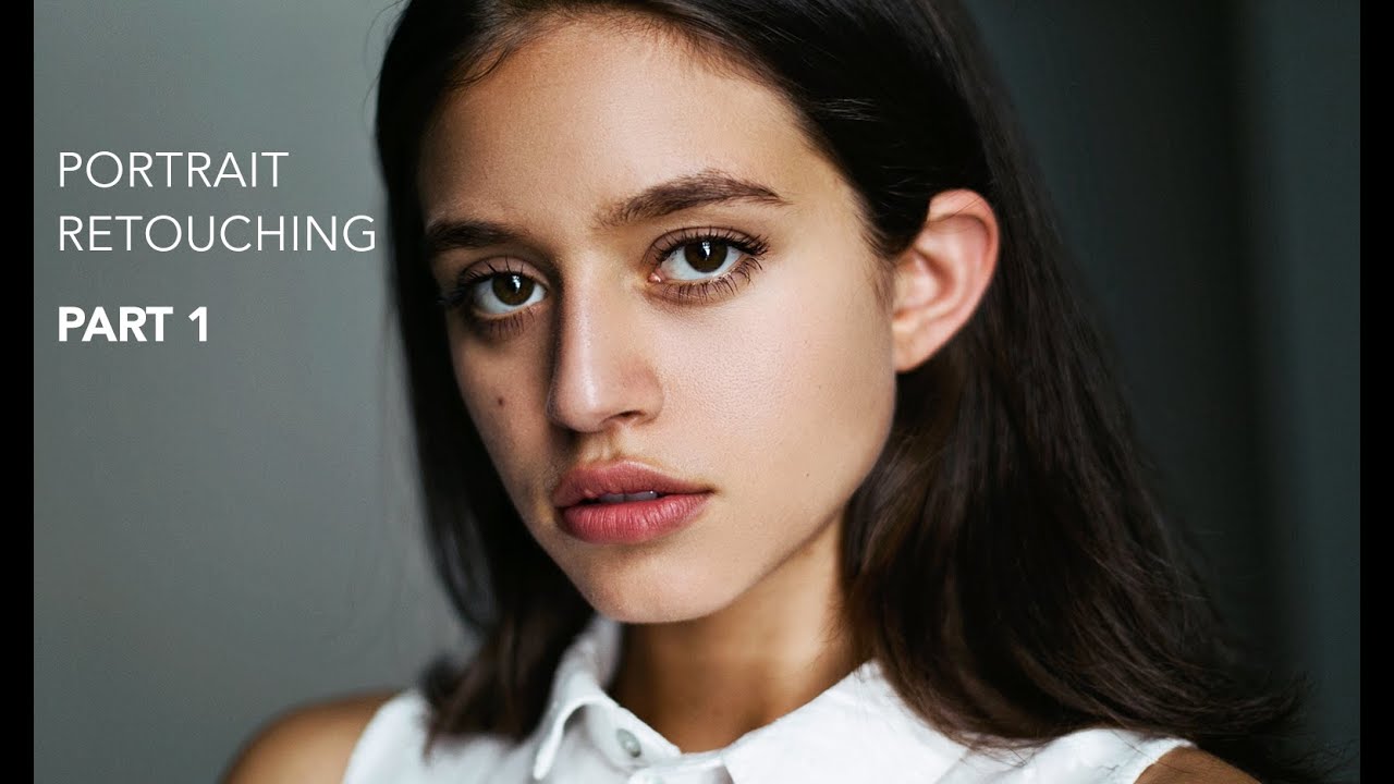
There’s a specific kind of dread that comes with opening a raw portrait file when the skin texture is rough and the tones are flat. Early in my retouching career, I used to attack those files with a healing brush and a prayer, smoothing everything until my subjects looked like they’d been dipped in wax. A client eventually said my edits looked “plastic,” and honestly, she was right. What I was missing wasn’t effort. It was a structured workflow that preserved texture while still cleaning up the image. That’s exactly what Jessica Kobeissi walks through in this tutorial, and it’s worth breaking down step by step for anyone who wants to understand not just what to do, but why each move matters.
Watch the full tutorial on YouTube
In this Jessica Kobeissi tutorial, she covers the full arc of a professional portrait edit: frequency separation for skin retouching, followed by a curves-based color grade that adds warmth and dimension without blowing out the image. It’s a two-part series, and this first installment handles the foundational work. What I appreciate about her approach is that she’s not performing expertise. She’s thinking out loud, showing you the judgment calls that separate a retoucher who’s developed real taste from someone just clicking through a checklist.
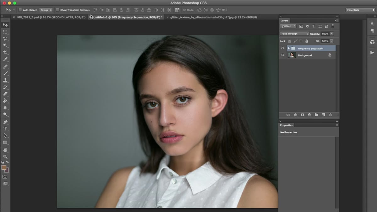
Step 1: Apply Frequency Separation
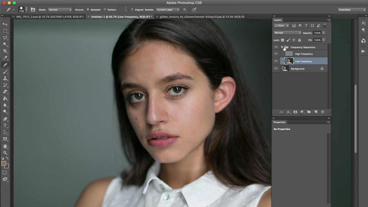 Frequency separation action being applied to portrait layer
Frequency separation is the technique here, and if you haven’t built it into your workflow yet, it’s worth making that the first priority. The method works by splitting your image into two layers: one that holds color and tone information, and one that holds fine texture detail like pores and skin grain. Because these two elements live on separate layers, you can smooth out uneven blotchiness on the tone layer without destroying the natural texture sitting above it.
Frequency separation action being applied to portrait layer
Frequency separation is the technique here, and if you haven’t built it into your workflow yet, it’s worth making that the first priority. The method works by splitting your image into two layers: one that holds color and tone information, and one that holds fine texture detail like pores and skin grain. Because these two elements live on separate layers, you can smooth out uneven blotchiness on the tone layer without destroying the natural texture sitting above it.
Jessica uses a pre-built Photoshop action to apply this setup automatically, which is the smart move. Building the action yourself is a worthwhile learning exercise once, but running it every time by hand is unnecessary friction. Once the action runs, you’ll be working primarily on the lower, texture-free layer using the clone stamp or healing brush, sampling nearby areas of similar tone to even out any discoloration or blemishes.
Step 2: Retouch with Restraint
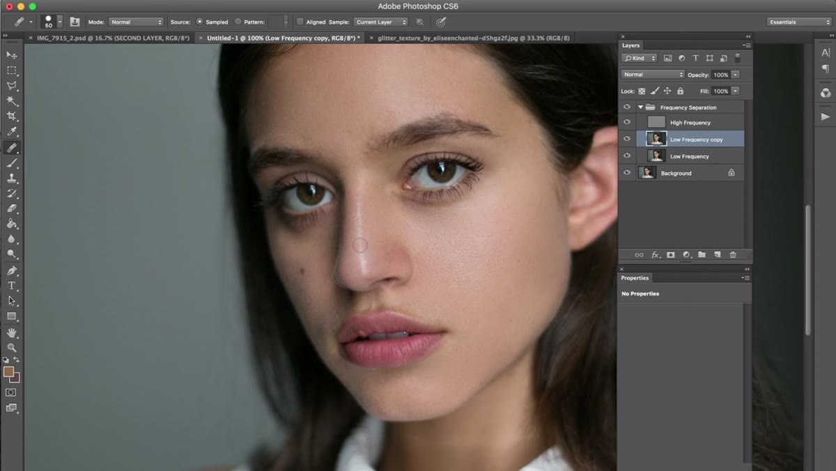 Close-up of skin being retouched with visible texture preserved
This is where a lot of retouchers, including past me, go too far. The temptation is to keep blending until every shadow and line disappears. Jessica is explicit about resisting that. You want to preserve the natural contour lines of the face, things like the shadow under the lower lip, the crease beside the nose, the way highlights sit on the cheekbones. Merging all of that into uniform skin tones is what creates the plastic effect.
Close-up of skin being retouched with visible texture preserved
This is where a lot of retouchers, including past me, go too far. The temptation is to keep blending until every shadow and line disappears. Jessica is explicit about resisting that. You want to preserve the natural contour lines of the face, things like the shadow under the lower lip, the crease beside the nose, the way highlights sit on the cheekbones. Merging all of that into uniform skin tones is what creates the plastic effect.
Work in small sections, zoom in close, and keep sampling from areas directly adjacent to what you’re correcting. When you’re done, Jessica suggests lowering the opacity of the retouch layer slightly so the work integrates more naturally with the original. Even dropping it to 80 or 85 percent can soften the boundary between retouched and untouched areas in a way that reads as skin rather than editing.
Step 3: Check Your Before and After
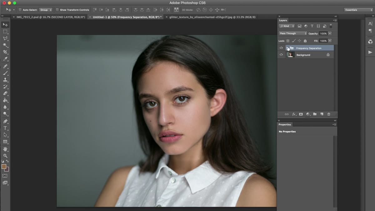 Before and after comparison of skin retouching on portrait
Before moving into color, toggle the retouching layers on and off to compare where you started. This isn’t just a feel-good moment. It’s quality control. You’re looking specifically for areas where you might have over-blended, spots that look unnaturally smooth compared to the surrounding skin, or places where you missed something that’s still pulling the eye.
Before and after comparison of skin retouching on portrait
Before moving into color, toggle the retouching layers on and off to compare where you started. This isn’t just a feel-good moment. It’s quality control. You’re looking specifically for areas where you might have over-blended, spots that look unnaturally smooth compared to the surrounding skin, or places where you missed something that’s still pulling the eye.
If the retouching looks subtle at this stage, you’re on the right track. Jessica’s before-and-after comparison in the tutorial shows a very clean result that still reads as a real person. That’s the goal. The color work coming next will add visual punch, so the skin retouching doesn’t need to carry the weight of making the image look finished.
Step 4: Open a Curves Adjustment Layer
 Curves adjustment layer panel open in Photoshop
The curves adjustment layer is the core tool for the color grade. Go to Layer, then New Adjustment Layer, then Curves. This single layer can handle luminosity, contrast, and individual color channel adjustments all at once, which is why it’s worth understanding deeply rather than defaulting to simpler tools like Brightness/Contrast.
Curves adjustment layer panel open in Photoshop
The curves adjustment layer is the core tool for the color grade. Go to Layer, then New Adjustment Layer, then Curves. This single layer can handle luminosity, contrast, and individual color channel adjustments all at once, which is why it’s worth understanding deeply rather than defaulting to simpler tools like Brightness/Contrast.
Jessica describes it with real enthusiasm, and that’s not accidental. Once you understand how pulling a point up or down on the RGB curve affects overall brightness, and how doing the same thing in an individual channel like Red, Green, or Blue shifts the color cast of your image, you have a genuinely powerful and precise tool in your hands.
Step 5: Adjust the Red and Green Channels
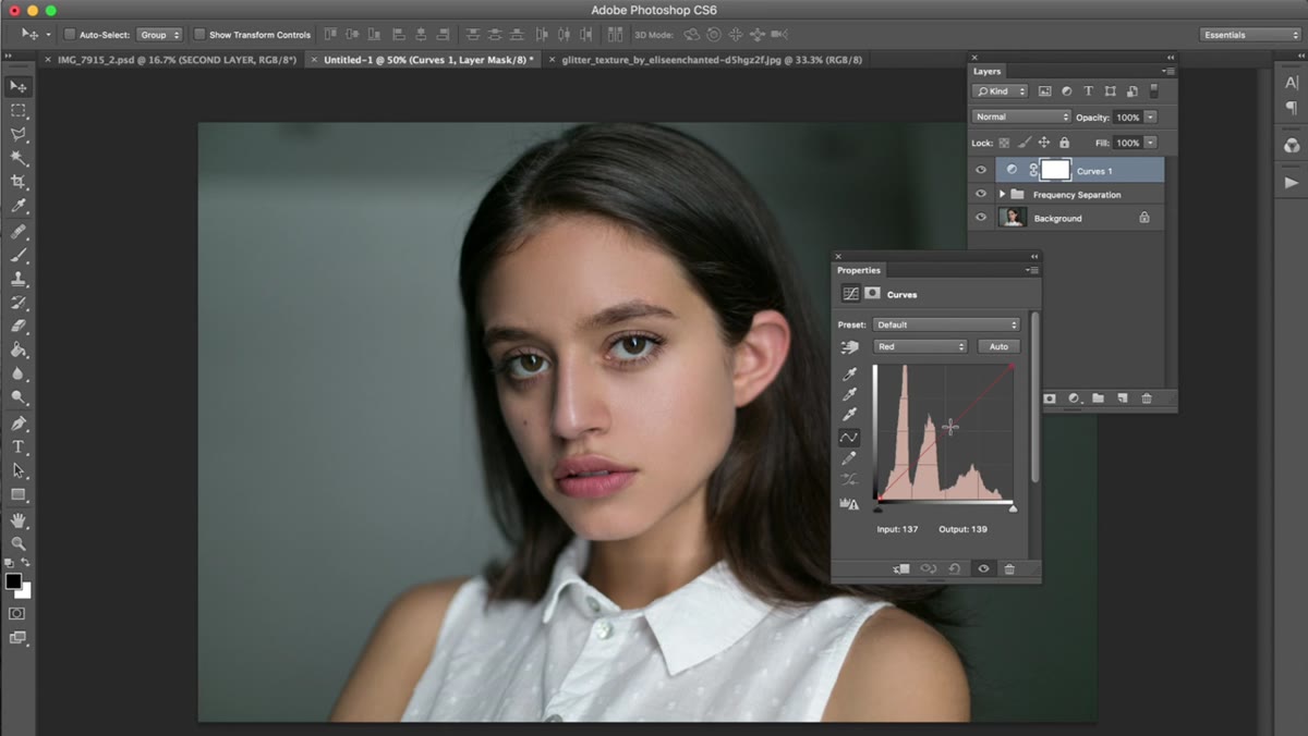 Red channel curve being pulled down slightly in curves panel
With the curves layer open, switch from the default RGB channel to the Red channel using the dropdown. Jessica brings the red curve down just slightly, a very small move toward the bottom right of the curve. This cools the warmer orange-red cast that raw skin tones often carry, giving the image a cleaner base to build on.
Red channel curve being pulled down slightly in curves panel
With the curves layer open, switch from the default RGB channel to the Red channel using the dropdown. Jessica brings the red curve down just slightly, a very small move toward the bottom right of the curve. This cools the warmer orange-red cast that raw skin tones often carry, giving the image a cleaner base to build on.
Then switch to the Green channel and bring that down by a similarly small amount. These are not dramatic moves. She describes them as “newborn” adjustments, which is exactly right. You’re not correcting for a visible problem. You’re steering the image toward a tonal palette with intention. Small shifts in individual channels compound across the whole image, so precision matters more here than force.
Step 6: Evaluate the Cumulative Effect
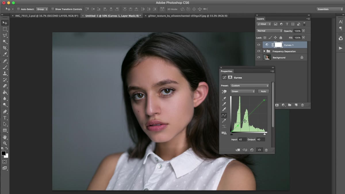 Full portrait showing color shift from curves adjustments applied
After making your channel adjustments, zoom out to the full image and toggle the curves layer on and off. The difference at this stage should feel like the image has a slightly more cohesive, intentional color palette without looking filtered. If the shift looks obvious or the skin tones have gone muddy, the curve adjustments were too aggressive and need to be walked back.
Full portrait showing color shift from curves adjustments applied
After making your channel adjustments, zoom out to the full image and toggle the curves layer on and off. The difference at this stage should feel like the image has a slightly more cohesive, intentional color palette without looking filtered. If the shift looks obvious or the skin tones have gone muddy, the curve adjustments were too aggressive and need to be walked back.
This evaluation step is part of the workflow, not an afterthought. Retouching and color grading are both iterative processes. Jessica’s comfort with checking her work mid-stream, rather than pressing forward and hoping it holds together, is part of what makes her results consistent.
A Note from My Own Experience: Saving Opacity as a Habit
One adjustment I’ve made to this workflow after running it on hundreds of client files is to save opacity reduction as a named step in my own action set rather than relying on myself to remember it at the end. It’s easy to spend forty minutes on retouching, feel satisfied, and then move into color without ever pulling that layer opacity down. Building it into the action as a reminder prompt has saved me from myself more than once.
I also keep the before-and-after comparison step as a literal pause in my process, where I make a cup of tea and step away from the screen for a few minutes before doing the final check. Your eyes adjust to what you’re looking at. Fresh eyes catch the over-blending that focused eyes miss.
The single most important thing this workflow teaches is that restraint is a skill. Knowing when to stop, when a line on a face is structural rather than a flaw, when a tone variation is texture rather than a problem, is what separates editing that looks like editing from editing that just looks like a great photograph. Watch the full tutorial on YouTube to see all of Jessica’s decisions in real time, including the second part of the series where the color work goes further.
Comments (1)
Finally someone explains this in a way that actually makes sense.
Leave a Comment