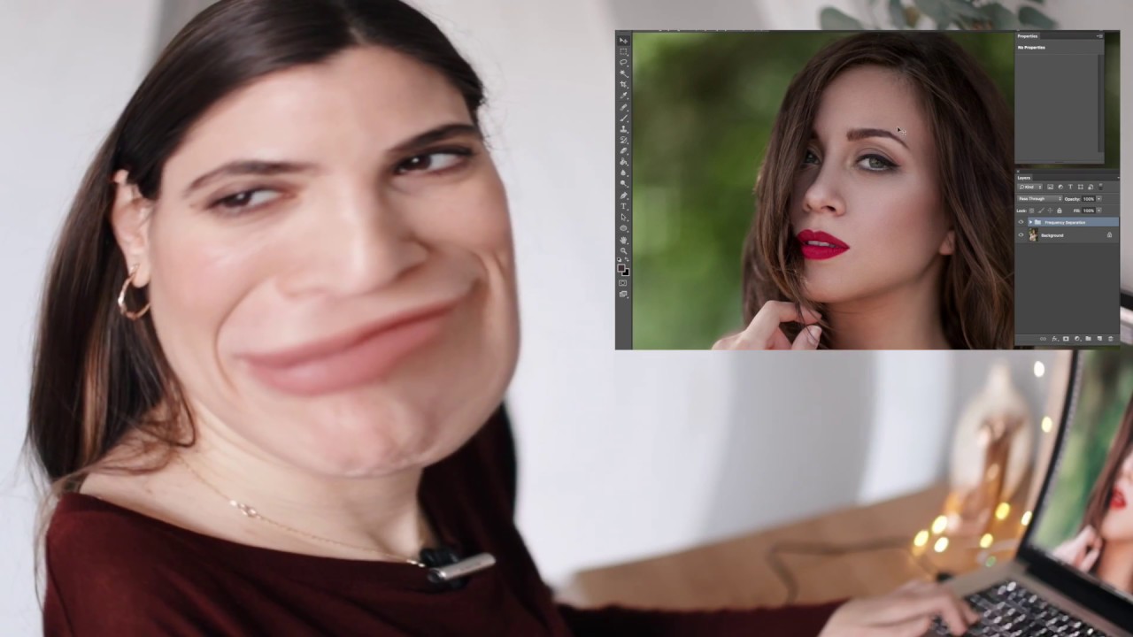
I still have my first retouching attempt saved on an old hard drive somewhere. It looked like someone had ironed the skin flat, cranked the saturation up to a setting I’d now describe as “fever dream,” and then added a glow filter just to make sure nobody could identify the original human underneath. I keep it around on purpose. It’s a useful reminder that craft takes time, and that looking back at old work with honest eyes is one of the fastest ways to figure out where you’ve actually grown.
That’s exactly what photographer Jessica Kobeissi does in this tutorial, and it’s one of the reasons I keep coming back to it. In Watch the full tutorial on YouTube, she pulls up a portrait she both shot and edited back in 2012, compares it to the original, and then retouches it fresh with the skills she has today. The result is a rare side-by-side that shows not just technique but editorial maturity. What changed isn’t just the tools she uses. It’s what she’s trying to achieve.
When I first transitioned from shooting weddings to doing beauty retouching full-time, I was still editing like a wedding photographer: dramatic, high-contrast, everything pushed just a little too far. A client gently told me my work looked “a little plastic.” That stung, but it redirected me toward something more nuanced. Watching Jessica walk through her own evolution reminded me that every retoucher has a version of that story. Here’s what her process actually looks like, broken down so you can follow along.
Step 1: Do an Honest Assessment of the Original Edit
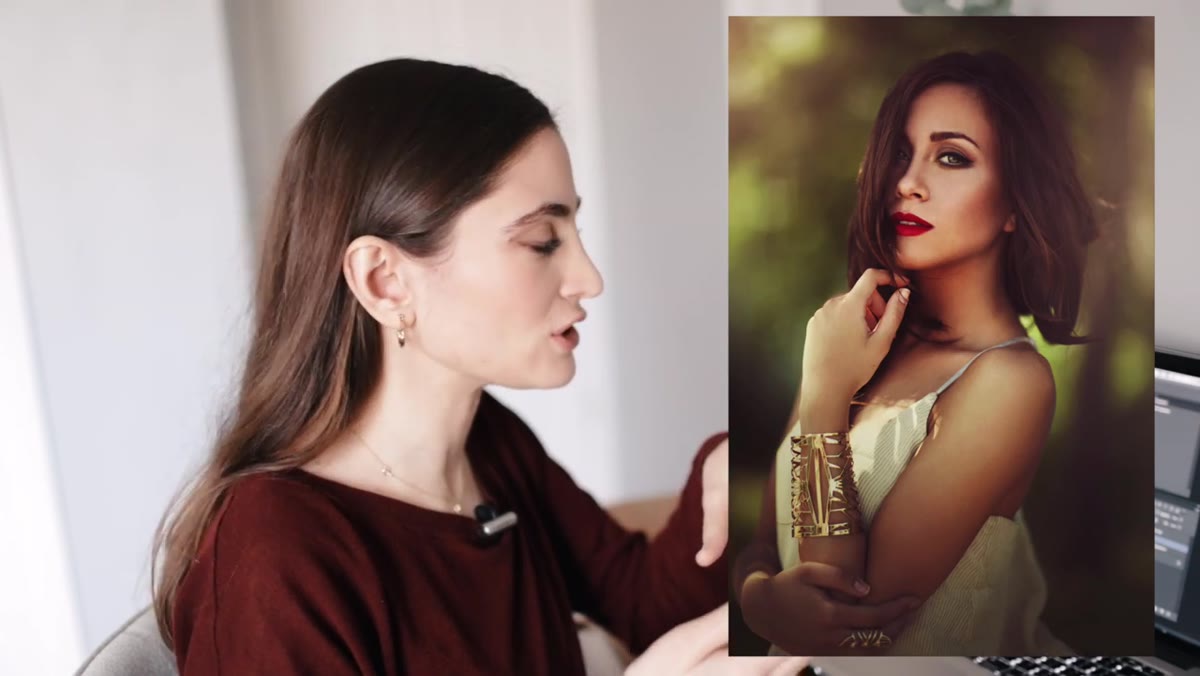 Side-by-side of the 2012 edit and original photo
Before opening a single panel, Jessica pulls up her 2012 version of the photo and actually looks at it critically. The original edit has over-processed eyes, blown highlights, and a hyper-saturated quality that reads as dated. She names these issues specifically rather than glossing over them.
Side-by-side of the 2012 edit and original photo
Before opening a single panel, Jessica pulls up her 2012 version of the photo and actually looks at it critically. The original edit has over-processed eyes, blown highlights, and a hyper-saturated quality that reads as dated. She names these issues specifically rather than glossing over them.
This matters more than it sounds. When we sit down to retouch a photo, especially one we’ve touched before, we tend to just start working. Spending even two or three minutes identifying the exact problems first gives you a roadmap. Ask yourself: where is the skin texture lost? Where are the tones competing? What did past-you do that future-you wants to undo? Write it down if you have to.
Step 2: Set Up Frequency Separation Layers Using an Action
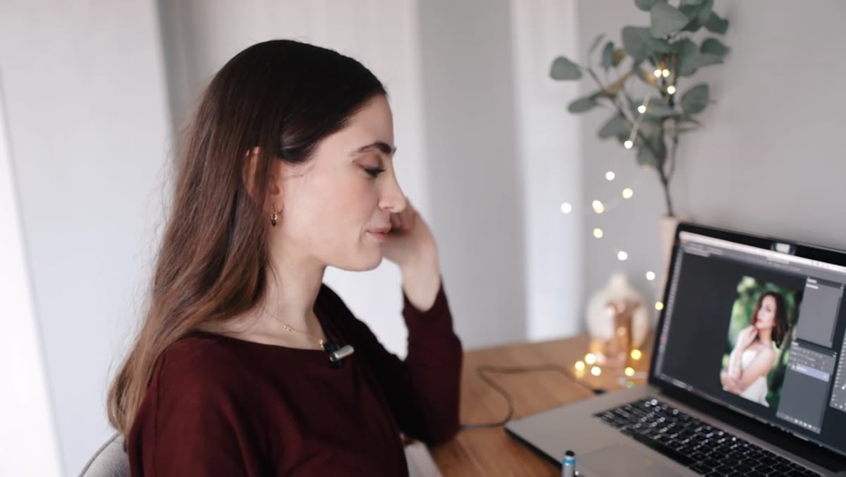 Frequency separation action being applied in Photoshop layers panel
Jessica uses a pre-built Photoshop action to set up her frequency separation layers. If you’re not using actions for this yet, it’s worth building one or downloading a trusted set. Frequency separation splits the image into two layers: a low-frequency layer that holds color and tone, and a high-frequency layer that holds texture and fine detail. Working on them independently means you can smooth uneven skin tone without destroying pore texture, which is the whole point.
Frequency separation action being applied in Photoshop layers panel
Jessica uses a pre-built Photoshop action to set up her frequency separation layers. If you’re not using actions for this yet, it’s worth building one or downloading a trusted set. Frequency separation splits the image into two layers: a low-frequency layer that holds color and tone, and a high-frequency layer that holds texture and fine detail. Working on them independently means you can smooth uneven skin tone without destroying pore texture, which is the whole point.
Her action adds both layers automatically and names them clearly. Once they’re in place, she heads straight to the low-frequency layer to begin. If you’re setting this up manually, apply a Gaussian Blur to the low-frequency layer (typically between 2 and 4 pixels for portrait work, depending on your file resolution) and use Apply Image on the high-frequency layer to isolate detail.
Step 3: Work the Low-Frequency Layer Along the Cheeks First
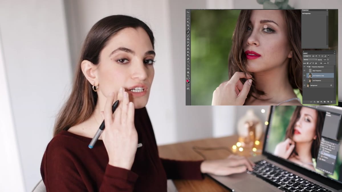 Painting on low-frequency layer near cheek area with tablet
She starts on the low-frequency layer at the cheek, which she describes as her usual entry point. Using her Wacom tablet and a soft brush set to a low opacity, she paints to even out the underlying tone. The goal here is not smoothness for its own sake. It’s consistency. You’re removing the uneven blotchiness caused by lighting variation or natural skin color shifts, while leaving the actual texture alone entirely.
Painting on low-frequency layer near cheek area with tablet
She starts on the low-frequency layer at the cheek, which she describes as her usual entry point. Using her Wacom tablet and a soft brush set to a low opacity, she paints to even out the underlying tone. The goal here is not smoothness for its own sake. It’s consistency. You’re removing the uneven blotchiness caused by lighting variation or natural skin color shifts, while leaving the actual texture alone entirely.
The tablet matters here. With a mouse, pressure-sensitive blending is nearly impossible and you end up overworking areas without realizing it. If you’re still using a mouse for retouching, even a budget entry-level tablet will immediately change how your low-frequency work feels. Work in small circular or dabbing strokes, not long sweeping ones, and keep your brush size close to the size of the area you’re correcting.
Step 4: Aim for Muted, Natural Color Rather Than Punchy Saturation
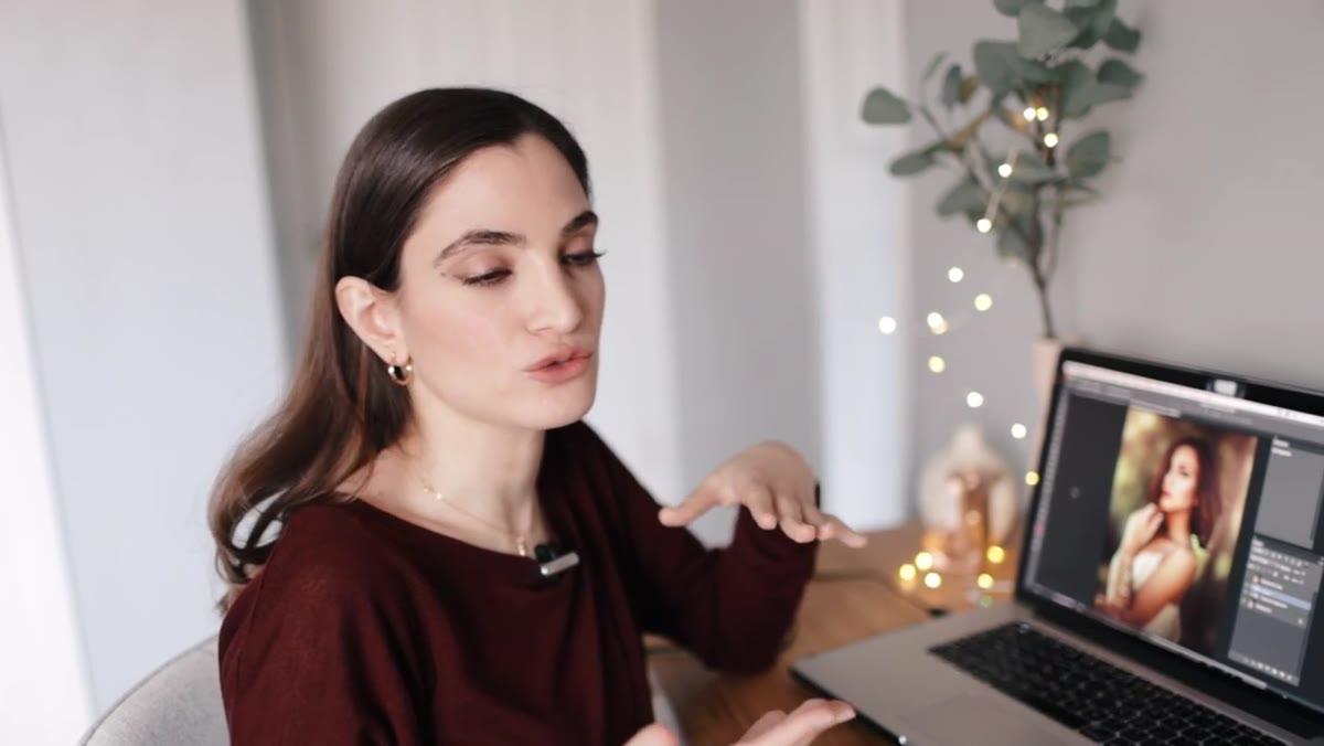 Comparison showing over-saturated 2012 edit vs. intended muted tones
One of the clearest differences Jessica points out between her old approach and her current one is color philosophy. The 2012 edit has that pushed, saturated look that was everywhere in the early 2010s. Today, she’s deliberately pulling back toward more muted, natural tones that feel closer to how the skin actually looked.
Comparison showing over-saturated 2012 edit vs. intended muted tones
One of the clearest differences Jessica points out between her old approach and her current one is color philosophy. The 2012 edit has that pushed, saturated look that was everywhere in the early 2010s. Today, she’s deliberately pulling back toward more muted, natural tones that feel closer to how the skin actually looked.
In practice, this means being conservative with any Hue/Saturation adjustments on the skin, and checking your work at 50% zoom or on a calibrated monitor rather than zoomed all the way in where everything looks more intense than it is. A good sanity check: desaturate your layer briefly and look at the luminosity. If the tones look balanced in black and white, the color has a solid foundation to sit on.
Step 5: Bring Back Skin Detail That Was Lost in the Original Edit
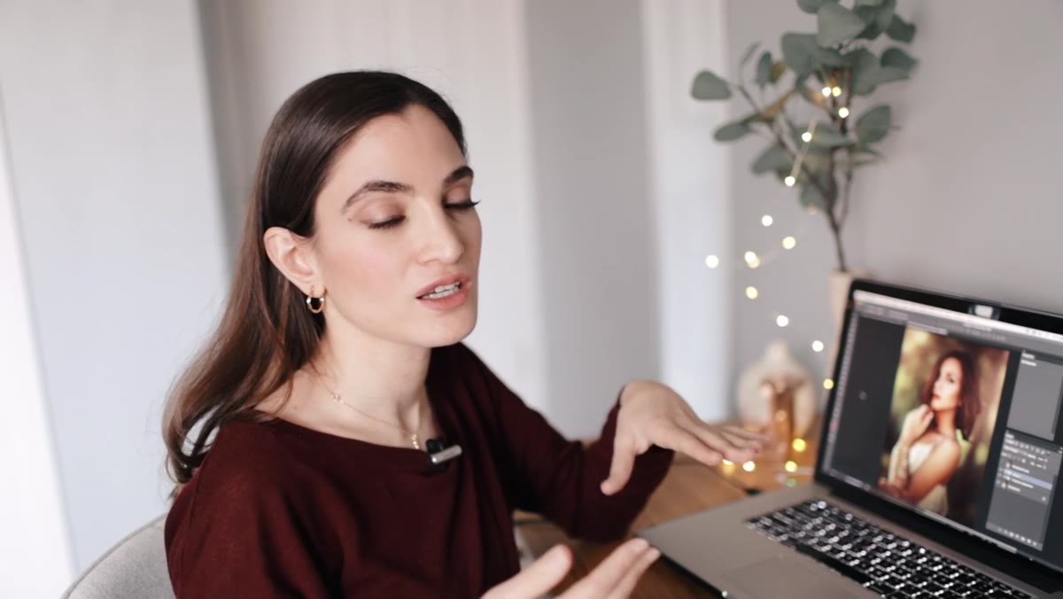 Jessica noting over-edited eyes and lost skin texture in old photo
The 2012 version had over-brightened eyes and flattened skin detail. Her goal with the current retouch is to restore what was there originally rather than replace it with something artificial. On the high-frequency layer, she preserves or lightly reinforces the natural texture so the final result looks like a real person rather than a render.
Jessica noting over-edited eyes and lost skin texture in old photo
The 2012 version had over-brightened eyes and flattened skin detail. Her goal with the current retouch is to restore what was there originally rather than replace it with something artificial. On the high-frequency layer, she preserves or lightly reinforces the natural texture so the final result looks like a real person rather than a render.
Resist the urge to clone-stamp or heal across large areas of the high-frequency layer. Instead, use the clone stamp at 100% opacity in Aligned mode and sample from nearby areas with similar texture. Small, targeted patches. If you find yourself healing a half-inch swath of skin, you’re working too broadly and you’ll end up with that telltale “waxy” look.
A Note From My Own Practice: The Value of Revisiting Old Work
Jessica frames this whole tutorial around the idea of showing where she came from, and I think that framing deserves more credit than it gets. Most retouching tutorials show you polished technique from someone already at the top of their game. This one shows you the gap, and the gap is instructive.
I make it a habit now to retouch one old photo every few months, not to fix it for a client, but just to see what I’d do differently. It tells me more about where my eye has developed than any technical exercise could. You start to see the assumptions you were making, the shortcuts you relied on, the things you were overcorrecting because you didn’t yet trust subtlety. If you haven’t tried this with your own archive, set aside an hour. Pick something you edited three or four years ago and go again. The comparison will teach you something you can’t get from a tutorial.
The single biggest takeaway from watching Jessica work through this is that good retouching is about restraint and intention, not about how many techniques you know. The technical foundation she uses, frequency separation, a tablet, careful color judgment, is learnable in an afternoon. The editorial judgment about when to stop, what to preserve, and what the photo actually needs? That takes years of honest self-assessment and a willingness to look at your old work without flinching.
Watch the full tutorial on YouTube and pay close attention to the moments where Jessica pauses and recalibrates. Those moments are where the real lesson lives.
Comments (2)
Tried this technique this morning. Game changer for real.
The tip about from over edited to intentiona was the missing piece for me. Thank you.
Leave a Comment