I’ll be honest with you: for years, I was a Photoshop-or-nothing person. Coming from wedding photography into beauty retouching, I built my entire workflow around layers, frequency separation, and a library of actions I’ve named after films. Lightroom felt like the place where images stopped, not where they got made. Then I sat down with Watch the full tutorial on YouTube this Sean Tucker tutorial on editing environmental portraits completely inside Lightroom, and I had one of those quiet, humbling moments where a working professional shows you that your assumptions were costing you time.
Tucker shot portraits of friends in South Africa, beautiful backlit environmental work with misty morning light, and his challenge to himself was to stay entirely within Lightroom from crop to color grade to light shaping. What struck me wasn’t just the final image. It was how deliberate and sequential his decision-making was. He wasn’t wandering through sliders hoping something clicked. He had a logic, and once I saw it, I started applying it to my own portrait work with beauty clients who want natural, editorial-feeling results without the full Photoshop treatment.
If you work with clients who send you RAW files and need a polished turnaround without a three-hour Photoshop session, this workflow is worth understanding from the inside out. Here is how Tucker builds it, step by step.
Step 1: Set Your Crop Before Anything Else
 Lightroom crop tool active, portrait framing adjusted
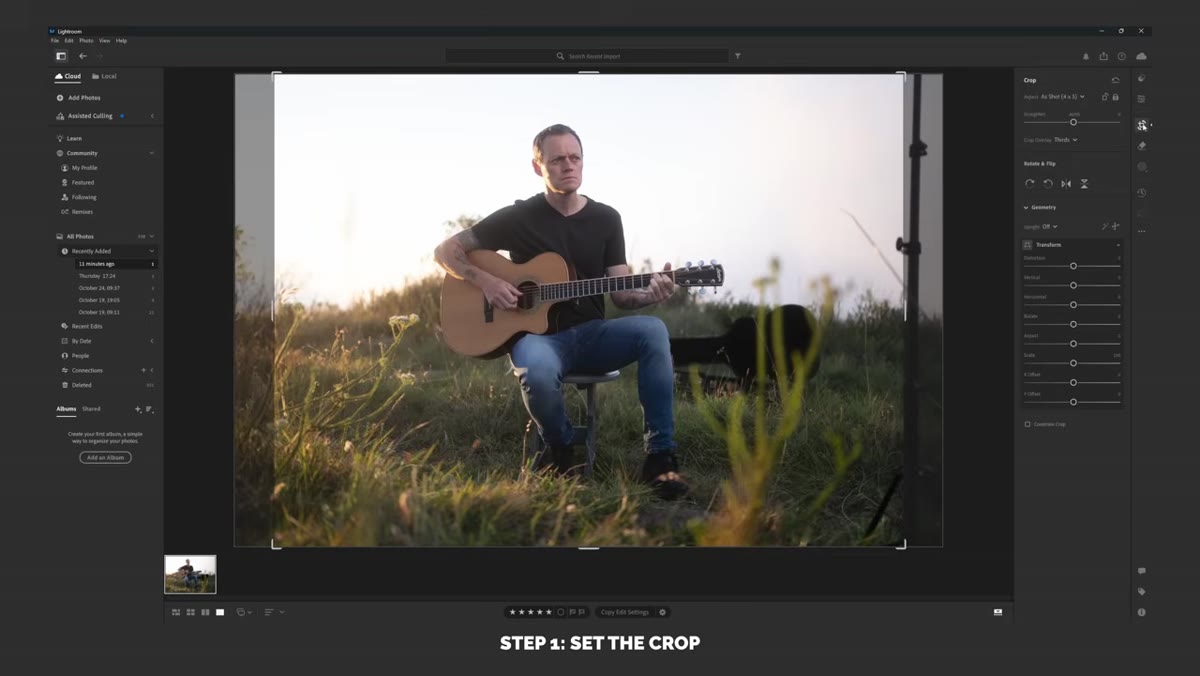
Before a single tone gets touched, Tucker locks in his composition. This sounds obvious, but most of us (myself included, for an embarrassing stretch of my career) adjust exposure first and crop later, which means we’re making tonal decisions based on a frame that might change. Tucker shot in a 4x3 ratio but retained extra 3x2 sensor data, giving him room to reframe deliberately. Settle your crop first, so every subsequent tonal and color decision is made on the actual image the viewer will see.
Lightroom crop tool active, portrait framing adjusted
Before a single tone gets touched, Tucker locks in his composition. This sounds obvious, but most of us (myself included, for an embarrassing stretch of my career) adjust exposure first and crop later, which means we’re making tonal decisions based on a frame that might change. Tucker shot in a 4x3 ratio but retained extra 3x2 sensor data, giving him room to reframe deliberately. Settle your crop first, so every subsequent tonal and color decision is made on the actual image the viewer will see.
Step 2: Use AI Sky Masking to Recover Highlight Detail Selectively
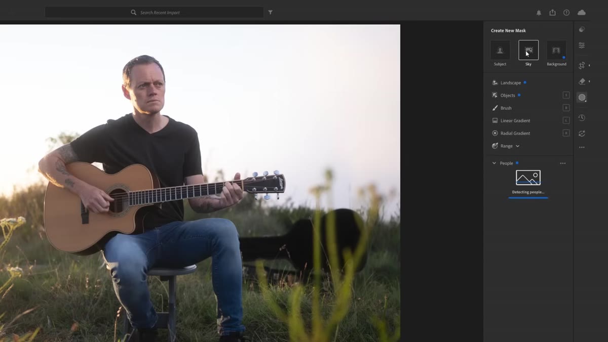 Masking panel open, sky selection highlighted in red overlay
Tucker’s scene had a bright, misty backlit sky with subtle tonal variation in the clouds. Rather than globally pulling highlights down and flattening the subject along with the sky, he went straight to the Masking panel and used the AI sky selection tool. Lightroom’s subject-aware masking is genuinely good at this kind of separation now. Once the sky was isolated, he dropped the highlights slider within that mask only, pulling back just enough to reveal the blue tones and cloud detail caught in the early light. The key word there is “just enough.” He didn’t chase full detail recovery. He kept it atmospheric. If your subject is backlit and the sky is blowing out, this is where you handle it before any global adjustments so you’re not fighting yourself later.
Masking panel open, sky selection highlighted in red overlay
Tucker’s scene had a bright, misty backlit sky with subtle tonal variation in the clouds. Rather than globally pulling highlights down and flattening the subject along with the sky, he went straight to the Masking panel and used the AI sky selection tool. Lightroom’s subject-aware masking is genuinely good at this kind of separation now. Once the sky was isolated, he dropped the highlights slider within that mask only, pulling back just enough to reveal the blue tones and cloud detail caught in the early light. The key word there is “just enough.” He didn’t chase full detail recovery. He kept it atmospheric. If your subject is backlit and the sky is blowing out, this is where you handle it before any global adjustments so you’re not fighting yourself later.
Step 3: Flatten the Global Tones Before You Add Contrast
 Basic panel sliders, highlights pulled down, shadows adjusted
Here is the part that reshapes how most people think about the basic panel. Tucker’s goal at this stage is not to make the image look good yet. It’s to make the tonal range even and workable. He pulls highlights down a touch globally, nudges shadows, adjusts whites downward slightly, and lifts the black point just a little. None of these moves are dramatic. The intention is to compress the range so that when contrast is added back through the tone curve, it goes in on his terms rather than being dictated by uneven raw data. Think of it as clearing the canvas before you actually paint.
Basic panel sliders, highlights pulled down, shadows adjusted
Here is the part that reshapes how most people think about the basic panel. Tucker’s goal at this stage is not to make the image look good yet. It’s to make the tonal range even and workable. He pulls highlights down a touch globally, nudges shadows, adjusts whites downward slightly, and lifts the black point just a little. None of these moves are dramatic. The intention is to compress the range so that when contrast is added back through the tone curve, it goes in on his terms rather than being dictated by uneven raw data. Think of it as clearing the canvas before you actually paint.
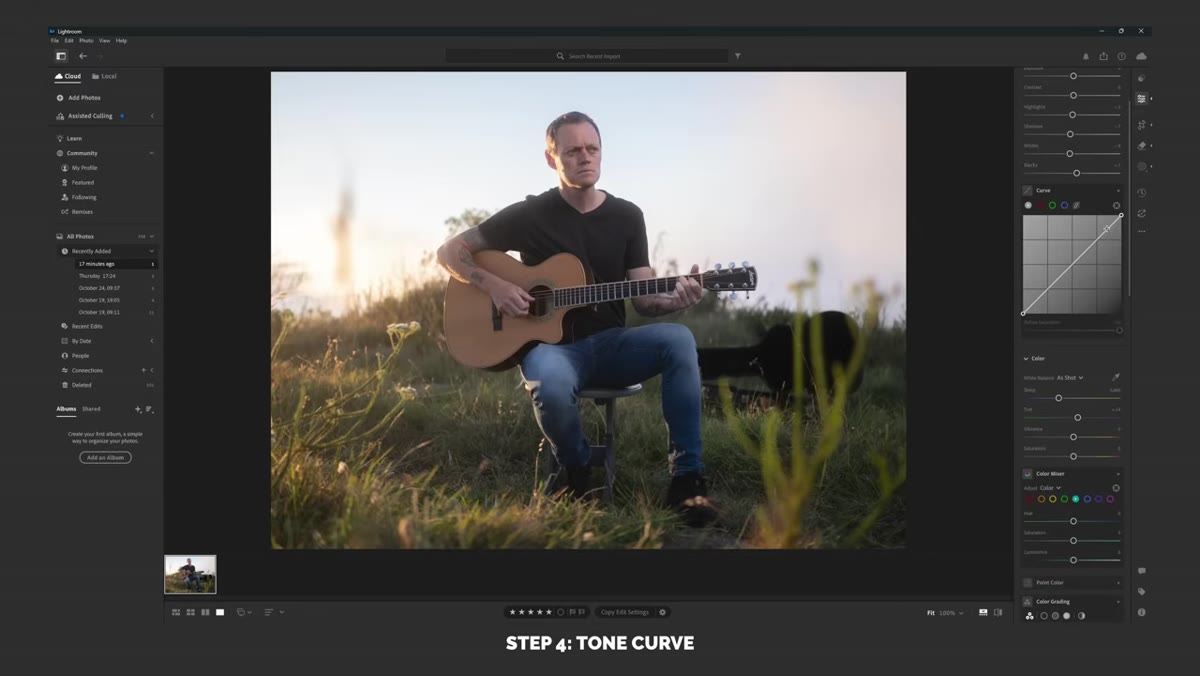
Step 4: Fade the Highlights in the Tone Curve First
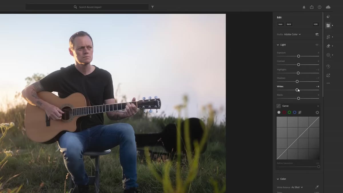 Tone curve panel, white point anchor dragged downward
This is the move that immediately caught my eye, because I do something similar in Photoshop with a curves adjustment layer and it never occurred to me that Lightroom’s tone curve could handle it just as elegantly. Tucker takes the white point anchor at the top right of the curve and pulls it downward rather than leaving it pinned at the corner. This lifts and softens the brightest tones, creating a faded, film-adjacent feel in the highlights. He makes the point that for backlit portraits or images with a lot of ambient light, lifting the shadows instead of the highlights is the more common stylistic choice, but fading the whites works especially well when the light source itself is part of the frame. It keeps the image from feeling harsh while preserving the sense of actual sunlight in the scene.
Tone curve panel, white point anchor dragged downward
This is the move that immediately caught my eye, because I do something similar in Photoshop with a curves adjustment layer and it never occurred to me that Lightroom’s tone curve could handle it just as elegantly. Tucker takes the white point anchor at the top right of the curve and pulls it downward rather than leaving it pinned at the corner. This lifts and softens the brightest tones, creating a faded, film-adjacent feel in the highlights. He makes the point that for backlit portraits or images with a lot of ambient light, lifting the shadows instead of the highlights is the more common stylistic choice, but fading the whites works especially well when the light source itself is part of the frame. It keeps the image from feeling harsh while preserving the sense of actual sunlight in the scene.
Step 5: Shape the Contrast With an S-Curve, Not the Contrast Slider
 Tone curve showing gentle S-shape with custom anchor points
With the white point already adjusted, Tucker builds contrast by adding a gentle S-curve rather than reaching for the contrast slider in the basic panel. The contrast slider is blunt. It applies a fixed curve that you cannot control. Drawing your own S-curve lets you decide exactly where the contrast lives. In portraits, you generally want the contrast in the midtones, where the skin and shadows are, and you want the extreme highlights and shadows to stay relatively soft. Anchor the curve at roughly the quarter and three-quarter points, push the midtone shadow side down a little, lift the midtone highlight side a little, and you have contrast that feels natural rather than punchy.
Tone curve showing gentle S-shape with custom anchor points
With the white point already adjusted, Tucker builds contrast by adding a gentle S-curve rather than reaching for the contrast slider in the basic panel. The contrast slider is blunt. It applies a fixed curve that you cannot control. Drawing your own S-curve lets you decide exactly where the contrast lives. In portraits, you generally want the contrast in the midtones, where the skin and shadows are, and you want the extreme highlights and shadows to stay relatively soft. Anchor the curve at roughly the quarter and three-quarter points, push the midtone shadow side down a little, lift the midtone highlight side a little, and you have contrast that feels natural rather than punchy.
A Note From My Own Retouching Practice
Tucker’s workflow confirmed something I keep coming back to in my workshops: the order of operations matters more than any individual setting. I’ve watched students spend forty-five minutes on a skin retouch only to realize their initial tonal decisions were working against them the whole time. The flatten-then-shape approach Tucker uses in Lightroom mirrors what I teach in Photoshop, where we neutralize before we stylize. What surprised me is how much of the light-shaping work I assumed required Photoshop’s dodge and burn layers can actually be handled with Lightroom’s masking and local adjustment tools, especially on environmental portraits where you’re working with large tonal zones rather than fine skin texture. For beauty close-ups where pore-level work matters, I still reach for frequency separation. But for editorial portraits and client gallery work that needs a fast, polished finish, this kind of contained Lightroom workflow deserves a permanent place in your toolkit.
The single most important thing Tucker demonstrates here is that Lightroom editing is not about reaching for every slider. It’s about building tones in sequence: isolate problem areas first, flatten the range globally, then add contrast back with precision. Every step earns the next one.
Watch the full tutorial on YouTube to see Tucker carry this through to the complete color grade and light shaping finish. It’s worth the full run time.
Comments (2)
The tip about how sean tuckers lightroom por was the missing piece for me. Thank you.
Solid advice. Especially the part about taking your time with it.
Leave a Comment