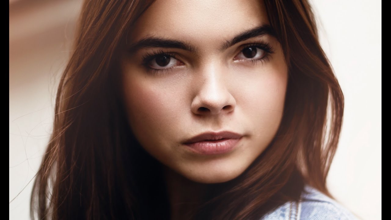
Color grading is the part of my retouching workflow that took the longest to stop feeling like guesswork. Skin retouching has rules you can learn and repeat. Color, though, feels more like cooking without a recipe until you build enough intuition to understand why certain combinations work. For a long time, my grades looked either flat or overdone, and I could not articulate why. What changed things was watching professionals who narrate their thinking, not just their mouse clicks.
In this Jessica Kobeissi tutorial, she walks through the color grading phase of a beauty portrait edit, picking up right after the skin retouching work she covered in Part 1. Watch the full tutorial on YouTube if you want to see the whole thing in motion. What I find genuinely useful about her approach is that she builds color in small, stacked layers rather than reaching for one dramatic adjustment. It mirrors how I work now, and it is the biggest difference between grades that feel intentional and grades that feel like a filter was slapped on at the end.
What follows is my breakdown of each step in her process, with enough detail that you can follow along in Photoshop without needing to pause and rewind every thirty seconds.
Step 1: Desaturate First with a Vibrance Adjustment Layer
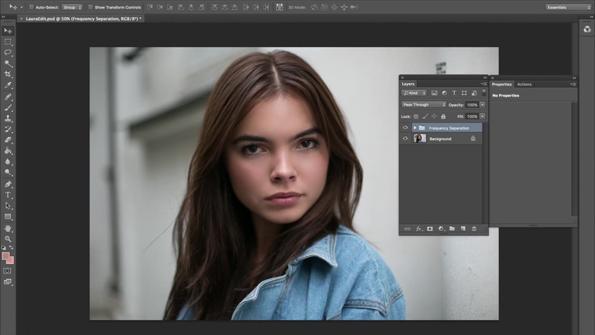 Vibrance adjustment layer panel with saturation pulled down
Before any color goes in, Jessica pulls the saturation down using a Vibrance adjustment layer. Go to Layer, New Adjustment Layer, Vibrance, and drag the Saturation slider into negative territory. How far you go depends on the image, but the point is to strip out the existing color cast so you are working with a neutral base. She frames it well: a heavily saturated image is a poor foundation because your color additions will fight with whatever is already there. Think of it like priming a wall before painting. The primer is not the final look, it just makes everything that comes after behave more predictably.
Vibrance adjustment layer panel with saturation pulled down
Before any color goes in, Jessica pulls the saturation down using a Vibrance adjustment layer. Go to Layer, New Adjustment Layer, Vibrance, and drag the Saturation slider into negative territory. How far you go depends on the image, but the point is to strip out the existing color cast so you are working with a neutral base. She frames it well: a heavily saturated image is a poor foundation because your color additions will fight with whatever is already there. Think of it like priming a wall before painting. The primer is not the final look, it just makes everything that comes after behave more predictably.
Step 2: Shape Contrast with a Curves Adjustment Layer
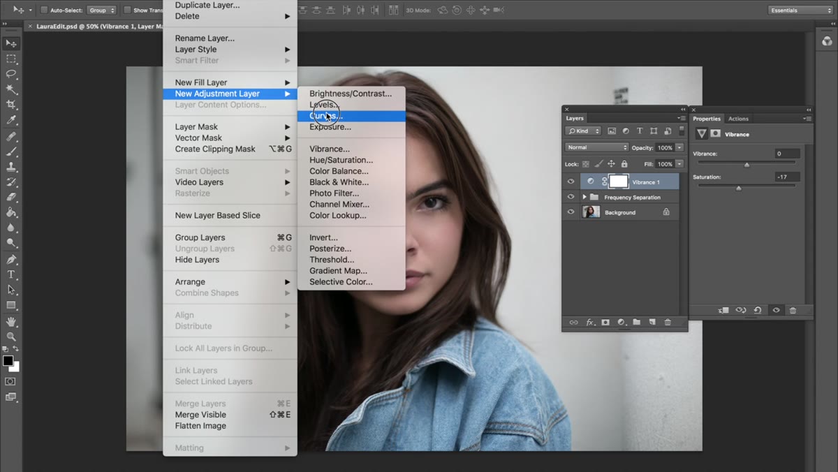 Curves adjustment panel showing S-curve adjustment
Next comes a Curves layer. Layer, New Adjustment Layer, Curves. Jessica lifts the highlights by pulling the upper portion of the curve upward, and adds depth by nudging the lower portion down slightly, creating a soft S-shape. This is not a dramatic contrast push. The goal is to give the image some tonal structure before color enters the picture. I think of Curves as building the skeleton. Every color decision you make afterward reads differently depending on how the tones underneath are sitting. A flat image will make your colors look muddy. A well-shaped curve lets them breathe.
Curves adjustment panel showing S-curve adjustment
Next comes a Curves layer. Layer, New Adjustment Layer, Curves. Jessica lifts the highlights by pulling the upper portion of the curve upward, and adds depth by nudging the lower portion down slightly, creating a soft S-shape. This is not a dramatic contrast push. The goal is to give the image some tonal structure before color enters the picture. I think of Curves as building the skeleton. Every color decision you make afterward reads differently depending on how the tones underneath are sitting. A flat image will make your colors look muddy. A well-shaped curve lets them breathe.
Step 3: Add Subtle Color with a Gradient Map Set to Soft Light
 Gradient Map dialog with Metals preset selected
This is where the first actual color enters the image, and it comes in quieter than you might expect. Add a Gradient Map via Layer, New Adjustment Layer, Gradient Map. Jessica uses a preset from Photoshop’s Metals gradient set. To access it, open the gradient picker inside the dialog, click the small gear or dropdown, and append the Metals set. She selects a metallic gradient that reads with warm and cool tones across the range. Then she changes the blending mode from Normal to Soft Light and brings the opacity down to around 41 percent. At full opacity this would look extreme. At 41 percent in Soft Light mode, it just adds a delicate tonal color shift that is hard to pin down but clearly improves the image.
Gradient Map dialog with Metals preset selected
This is where the first actual color enters the image, and it comes in quieter than you might expect. Add a Gradient Map via Layer, New Adjustment Layer, Gradient Map. Jessica uses a preset from Photoshop’s Metals gradient set. To access it, open the gradient picker inside the dialog, click the small gear or dropdown, and append the Metals set. She selects a metallic gradient that reads with warm and cool tones across the range. Then she changes the blending mode from Normal to Soft Light and brings the opacity down to around 41 percent. At full opacity this would look extreme. At 41 percent in Soft Light mode, it just adds a delicate tonal color shift that is hard to pin down but clearly improves the image.
Step 4: Refine Color Ranges with Selective Color
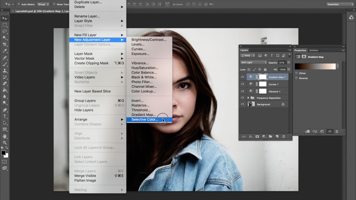 Selective Color panel open on the Whites channel
Selective Color is one of those adjustments that rewards patience and penalizes rushing. Go to Layer, New Adjustment Layer, Selective Color. Jessica works primarily in the Whites tab and the Blacks tab. In the Whites, she adjusts the sliders to pull back the brightness of the brightest parts of the image without blowing them out, giving the highlights a slightly warmer, softer feel. In the Blacks tab, she brings the Black slider out slightly, which lifts the shadows from pure black toward a dark gray. This is a classic way to add a matte quality to an image without flattening the midtones. Her advice here is honest: she does not have predetermined numbers. She toggles each channel back and forth until something looks right, and then she stops. That is actually the correct approach for Selective Color because every image will respond differently.
Selective Color panel open on the Whites channel
Selective Color is one of those adjustments that rewards patience and penalizes rushing. Go to Layer, New Adjustment Layer, Selective Color. Jessica works primarily in the Whites tab and the Blacks tab. In the Whites, she adjusts the sliders to pull back the brightness of the brightest parts of the image without blowing them out, giving the highlights a slightly warmer, softer feel. In the Blacks tab, she brings the Black slider out slightly, which lifts the shadows from pure black toward a dark gray. This is a classic way to add a matte quality to an image without flattening the midtones. Her advice here is honest: she does not have predetermined numbers. She toggles each channel back and forth until something looks right, and then she stops. That is actually the correct approach for Selective Color because every image will respond differently.
Step 5: Warm the Image with a Black and White Layer in Soft Light
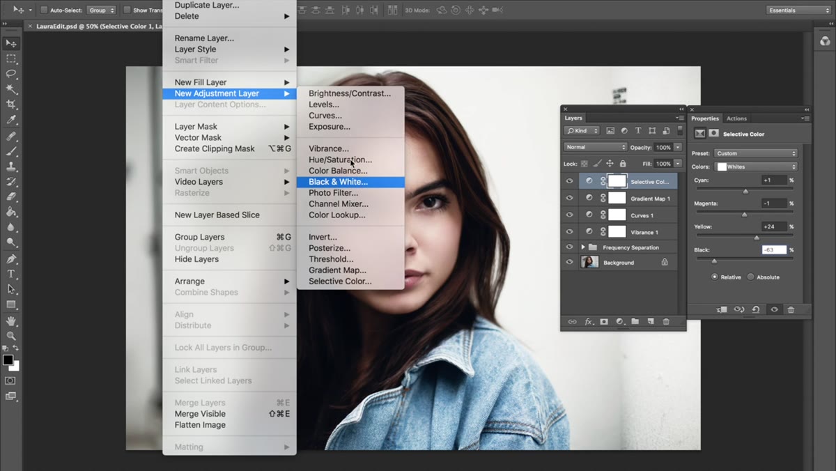 Black & White adjustment layer with Tint checkbox selected
This step surprised me the first time I saw it used. Add a Black and White adjustment layer via Layer, New Adjustment Layer, Black and White. Check the Tint box in the panel and then click the color swatch next to it to choose a tint color. Jessica selects a warm brownish hue. Then change the blending mode to Soft Light. At this point the layer is doing something subtle but important: it is pushing warmth into the image without simply raising orange saturation, which can quickly make skin look sunburned. The soft light blending mode means the tint wraps into the tones rather than sitting on top of them. Keep opacity low enough that you would almost not notice the layer if you toggled it on and off, because that means it is working correctly.
Black & White adjustment layer with Tint checkbox selected
This step surprised me the first time I saw it used. Add a Black and White adjustment layer via Layer, New Adjustment Layer, Black and White. Check the Tint box in the panel and then click the color swatch next to it to choose a tint color. Jessica selects a warm brownish hue. Then change the blending mode to Soft Light. At this point the layer is doing something subtle but important: it is pushing warmth into the image without simply raising orange saturation, which can quickly make skin look sunburned. The soft light blending mode means the tint wraps into the tones rather than sitting on top of them. Keep opacity low enough that you would almost not notice the layer if you toggled it on and off, because that means it is working correctly.
Step 6: Finish with Color Bubbles Using a Gradient Fill Layer
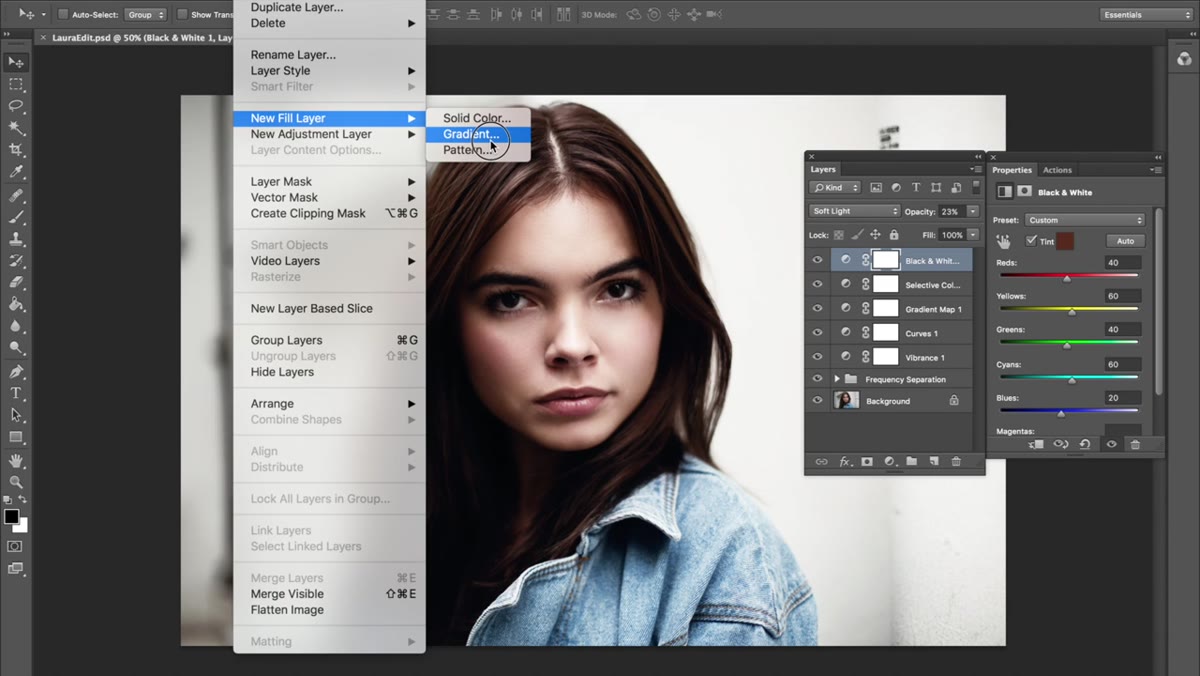 New Fill Layer menu with Gradient option highlighted
Jessica’s final move is what she calls “color bubbles,” a nickname she has apparently been using since around 2005. Go to Layer, New Fill Layer, Gradient. This is different from a Gradient Map because it is placing an actual gradient of color across the frame, typically used to push a color cast into a specific area of the image, like a warm glow in the highlights or a cool tint in the shadows. The exact settings will depend on the look you are going for, but the principle is directional color influence rather than a global shift. It is a great finishing layer because it adds something a little more specific and photographic, almost like the color cast you would get from a particular light source or a film stock.
New Fill Layer menu with Gradient option highlighted
Jessica’s final move is what she calls “color bubbles,” a nickname she has apparently been using since around 2005. Go to Layer, New Fill Layer, Gradient. This is different from a Gradient Map because it is placing an actual gradient of color across the frame, typically used to push a color cast into a specific area of the image, like a warm glow in the highlights or a cool tint in the shadows. The exact settings will depend on the look you are going for, but the principle is directional color influence rather than a global shift. It is a great finishing layer because it adds something a little more specific and photographic, almost like the color cast you would get from a particular light source or a film stock.
What I Do Differently After Learning This Approach
The layered philosophy here is something I have fully adopted, but I build in one extra habit: I group all my color grade layers into a single folder and attach a black layer mask to the whole group. That way, if a client asks me to show them the image before and after grading, I can toggle the entire grade on and off with one click rather than hunting through individual layers. I also tend to keep my Selective Color adjustments even more conservative than Jessica’s starting point, because my beauty clients often have very specific brand color standards and I need to leave room for their art director to adjust without blowing out the grade entirely.
The single most important idea in this tutorial is one Jessica repeats more than once: small layers compound into something beautiful. One adjustment at 15 percent opacity looks like nothing. Six adjustments at 15 percent opacity, each doing something slightly different, look like a cohesive, professional color grade. That is the whole secret, and it is worth watching her demonstrate it in real time. Watch the full tutorial on YouTube and pay attention to how the image shifts at each stage. The individual steps are modest. The cumulative result is not.
Comments (7)
Just used this on a wedding shoot edit. Client was thrilled.
The before and after really sells it. Incredible difference.
Couldn't agree more. I've seen this make a huge difference in photography work specifically.
Applied this to my portfolio shots and the improvement is noticeable.
Love this. I referenced a similar technique in one of my recent posts. Always good to see other perspectives.
Just subscribed. If the rest of your content is this good, I'm in.
Tried this technique this morning. Game changer for real.
Leave a Comment