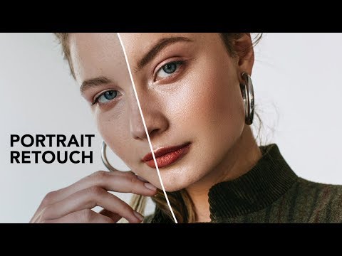
There’s a specific kind of dread that comes with opening a portrait file and knowing the skin needs work. For a long time, I avoided it by over-relying on the Healing Brush and hoping for the best. The results looked exactly as chaotic as that sounds. It wasn’t until I started studying how other working photographers actually moved through a full retouch, tool by tool, that things started to click. Watch the full tutorial on YouTube - it’s one of the clearest end-to-end walkthroughs I’ve come across.
In this Jessica Kobeissi tutorial, she walks through a complete portrait edit from raw retouching all the way through color grading. What I appreciate most is that she isn’t chasing perfection. She’s chasing believability. That distinction took me an embarrassing amount of time to learn after a client once told me my retouches looked “like a video game character.” Kobeissi’s approach is grounded in the same philosophy I now teach in my own workshops: skin should look like skin, just on a good day.
The workflow she uses is built around frequency separation, a technique that separates the texture of skin from its tone and color so you can work on each independently. If you’ve never used it before, the steps below will give you a solid foundation. If you have, you’ll probably pick up at least one thing here worth folding into your own process.
Step 1: Set Up Your Frequency Separation Layers
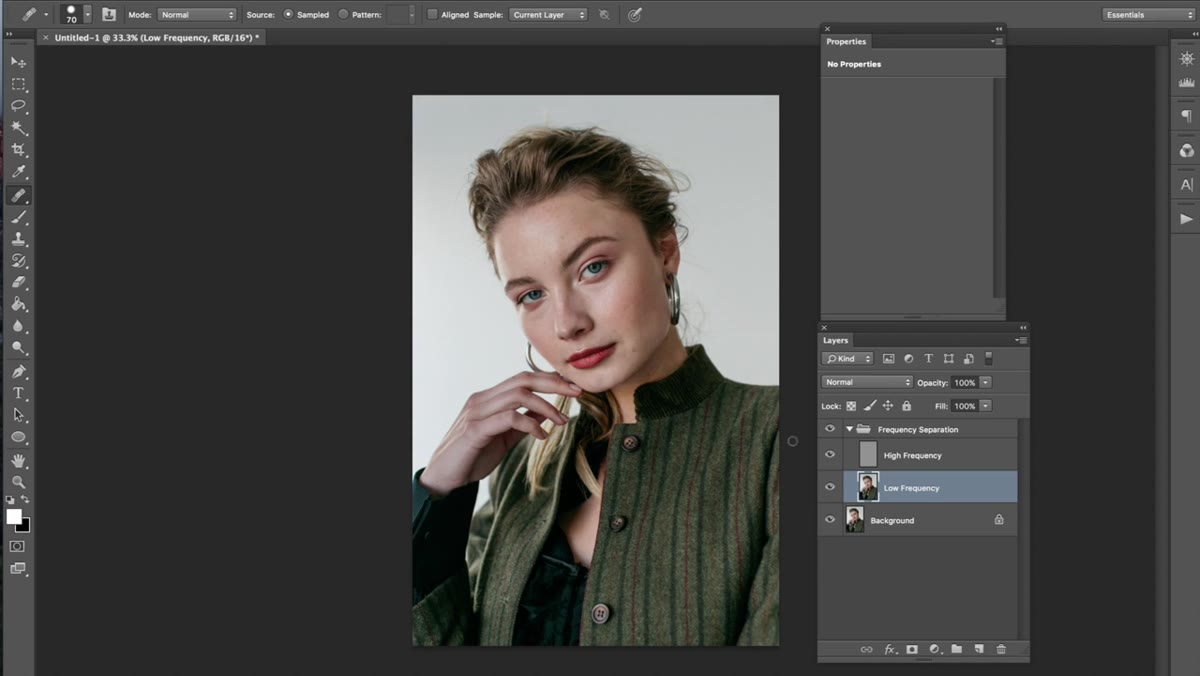 Frequency separation folder visible in Photoshop layers panel
Kobeissi begins with a frequency separation action already applied, which generates the necessary layer structure automatically. If you don’t have an action set up yet, you’ll want to learn the manual method first so you understand what each layer is actually doing. The key layers are a low frequency layer (holding color and tone) and a high frequency layer (holding texture and detail). Kobeissi recommends duplicating the low frequency layer before touching anything, using Cmd/Ctrl + J. This gives you a non-destructive copy to paint on while keeping the original intact below.
Frequency separation folder visible in Photoshop layers panel
Kobeissi begins with a frequency separation action already applied, which generates the necessary layer structure automatically. If you don’t have an action set up yet, you’ll want to learn the manual method first so you understand what each layer is actually doing. The key layers are a low frequency layer (holding color and tone) and a high frequency layer (holding texture and detail). Kobeissi recommends duplicating the low frequency layer before touching anything, using Cmd/Ctrl + J. This gives you a non-destructive copy to paint on while keeping the original intact below.
Step 2: Work the Low Frequency Layer to Even Skin Tone
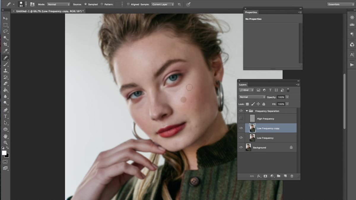
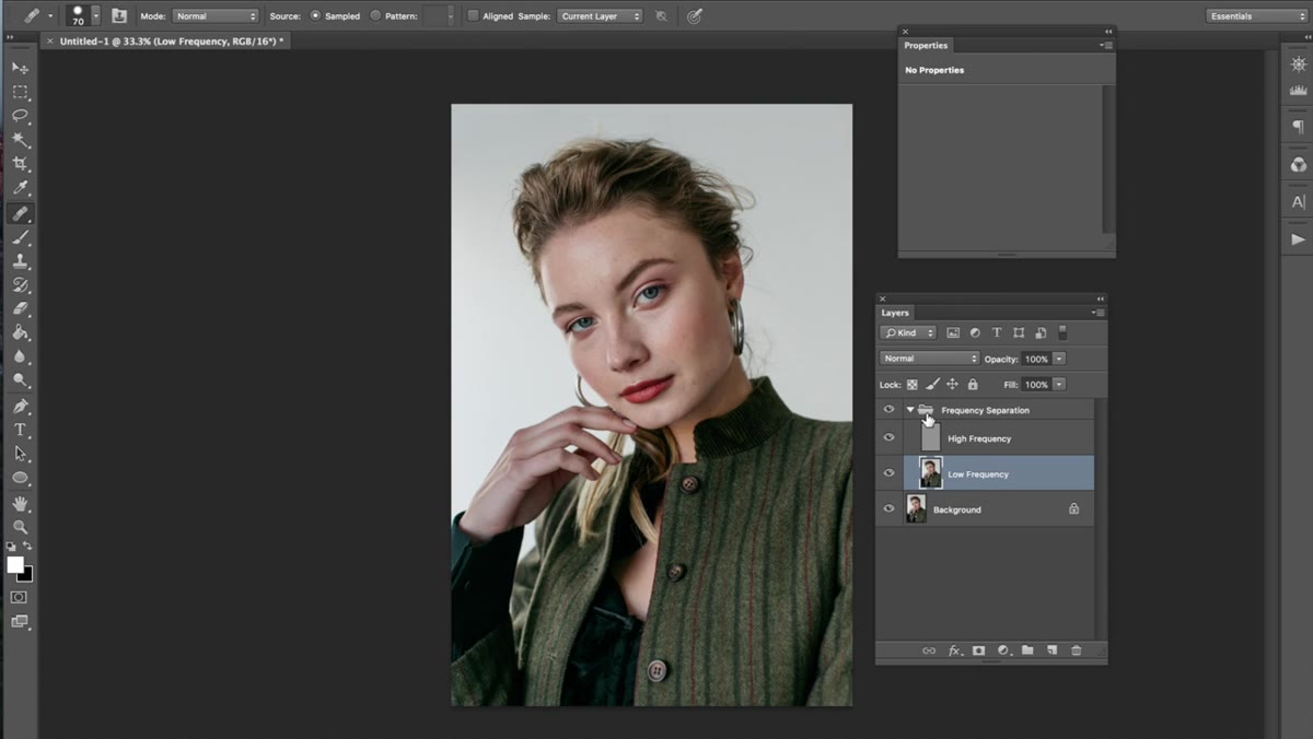 Clone Stamp sampling skin tone on low frequency layer, forehead area
With the low frequency layer duplicate selected, Kobeissi zooms into the forehead and begins sampling skin tone using the Clone Stamp tool. The technique here is to hold Alt (Option on Mac) to sample a clean area of skin nearby, then paint over any uneven patches. The goal isn’t to eliminate variation entirely. Skin naturally has shifts in tone, and flattening those completely is what produces that plastic look nobody wants. Instead, she’s smoothing the transitions between areas of color, so the light moves across the face naturally.
Clone Stamp sampling skin tone on low frequency layer, forehead area
With the low frequency layer duplicate selected, Kobeissi zooms into the forehead and begins sampling skin tone using the Clone Stamp tool. The technique here is to hold Alt (Option on Mac) to sample a clean area of skin nearby, then paint over any uneven patches. The goal isn’t to eliminate variation entirely. Skin naturally has shifts in tone, and flattening those completely is what produces that plastic look nobody wants. Instead, she’s smoothing the transitions between areas of color, so the light moves across the face naturally.
She also toggles off the high frequency layer periodically to get a clearer read on the tonal work happening underneath. This is a smart habit. When texture is visible, your eye gets distracted and it’s harder to judge whether the blending is actually working. Hiding that layer temporarily helps you evaluate the low frequency work on its own terms.
Step 3: Sample Strategically, Not Randomly
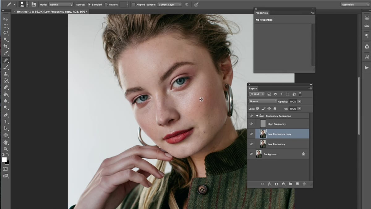 Clone Stamp tool active, Alt-sampling near the area being corrected
One detail Kobeissi emphasizes that newer retouchers often miss: always sample from an area close to the spot you’re correcting. Skin tone shifts across the face. The tone near the nose is different from the tone near the cheekbone, which is different again near the jaw. If you sample from too far away, you’ll stamp in color that doesn’t belong there, and the blending will look off even if the brushwork is clean. Keep your sample point within the same zone you’re working in and move it frequently as you travel across the face.
Clone Stamp tool active, Alt-sampling near the area being corrected
One detail Kobeissi emphasizes that newer retouchers often miss: always sample from an area close to the spot you’re correcting. Skin tone shifts across the face. The tone near the nose is different from the tone near the cheekbone, which is different again near the jaw. If you sample from too far away, you’ll stamp in color that doesn’t belong there, and the blending will look off even if the brushwork is clean. Keep your sample point within the same zone you’re working in and move it frequently as you travel across the face.
This is one of those things that genuinely takes time to internalize. Your eye has to learn what “close enough” looks like, and that education comes from looking at a lot of portraits, not just practicing the tool mechanics. Kobeissi mentions studying magazine work and images you admire as a way of training your visual reference. I’d add: save examples of retouching you think looks great and study what specifically makes the skin read as real.
Step 4: Keep the High Frequency Layer Untouched for Now
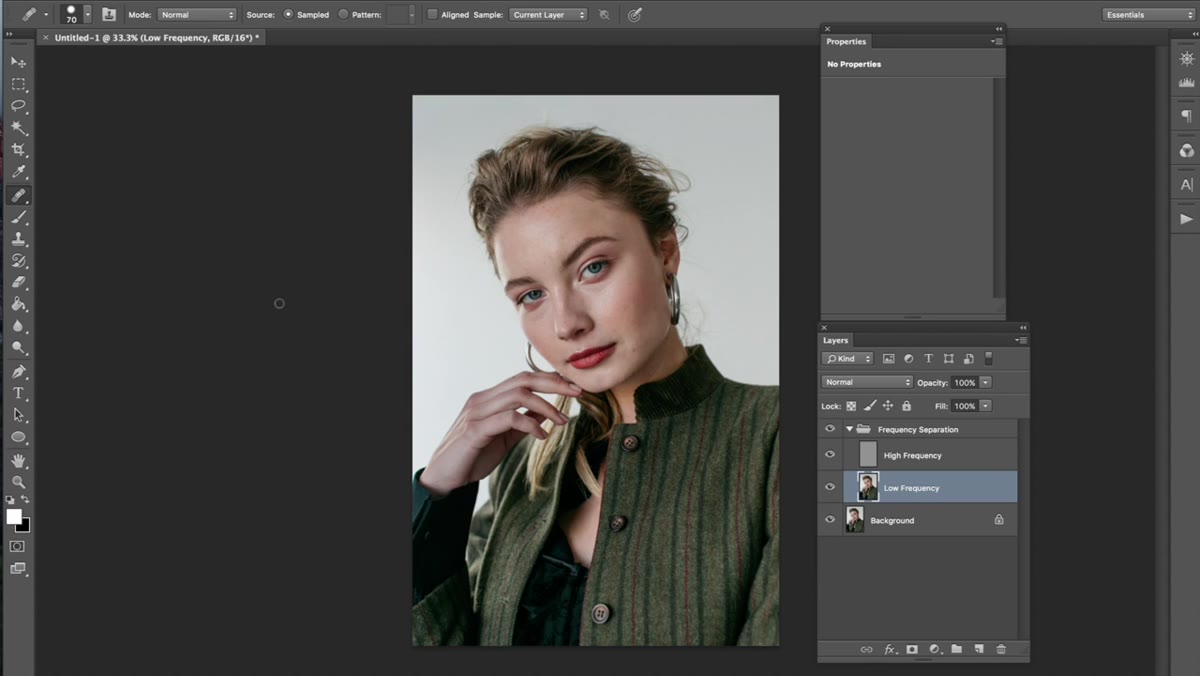
 High frequency layer toggled off showing smooth low frequency beneath
Throughout the skin retouching phase, Kobeissi leaves the high frequency layer alone. This is the layer that holds all the pore texture, fine lines, and surface detail. Because frequency separation keeps these two elements separate, fixing the tone on the low frequency layer doesn’t blur or damage the texture at all. The skin retains its natural surface quality even after significant tonal correction underneath.
High frequency layer toggled off showing smooth low frequency beneath
Throughout the skin retouching phase, Kobeissi leaves the high frequency layer alone. This is the layer that holds all the pore texture, fine lines, and surface detail. Because frequency separation keeps these two elements separate, fixing the tone on the low frequency layer doesn’t blur or damage the texture at all. The skin retains its natural surface quality even after significant tonal correction underneath.
This is the core reason frequency separation is worth learning. Traditional retouching methods that blend directly on a flattened image will soften texture every time you smooth tone. Frequency separation lets you have both: clean, even tone and genuine-looking skin texture, without one compromising the other.
Step 5: Color Grade to Unify and Finish the Image
 Before and after portrait comparison showing color grade applied
After the retouching is complete, Kobeissi moves into color grading, which she describes as where the image gets its final personality. She doesn’t detail every slider in this tutorial, but the principle is that color grading should feel cohesive with the retouching, not bolted on afterward. The tones you introduce in the grade will interact with the skin tones you’ve carefully balanced, so it pays to think about them together.
Before and after portrait comparison showing color grade applied
After the retouching is complete, Kobeissi moves into color grading, which she describes as where the image gets its final personality. She doesn’t detail every slider in this tutorial, but the principle is that color grading should feel cohesive with the retouching, not bolted on afterward. The tones you introduce in the grade will interact with the skin tones you’ve carefully balanced, so it pays to think about them together.
A warm grade, for example, will shift the neutral skin areas you corrected into slightly golden territory. A cool grade will push them toward desaturated blue-greens. Neither is wrong, but you need to be watching the skin as you grade so you can compensate if needed. Small adjustments to Hue/Saturation or Selective Color on the skin range can bring everything back into balance.
What I’d Add from My Own Practice
Kobeissi makes a point I want to underline: don’t feel discouraged if frequency separation feels impossible at first. When I spent a serious stretch of time committing to this technique, the first month of work looked rough. The color patches were obvious, the blending was choppy, and I questioned whether I’d ever get it. What turned the corner for me wasn’t a new tutorial. It was slowing down, zooming in further than felt comfortable, and working in smaller brush strokes with lower opacity. Frequency separation rewards patience more than almost any other retouching technique.
I’d also suggest naming your actions in a way that makes sense to you. My frequency separation action is called “The Prestige” because, like the film, there are three parts and the payoff only makes sense at the end. Silly, but I never forget which action to run.
The single most important idea in this tutorial is one Kobeissi threads through the whole thing without ever making it the headline: good retouching is invisible. Your job is to remove distractions from the viewer’s connection to the subject, not to demonstrate how many tools you know. If you’re looking at a finished portrait and your eye goes to the retouching rather than the person, keep going.
Watch the full tutorial on YouTube to see exactly how Kobeissi moves through each stage in real time. Watching her brush pace and sampling rhythm is worth as much as any written breakdown.
Comments (3)
The before and after really sells it. Incredible difference.
This is the kind of content that keeps me coming back.
Couldn't agree more. I've seen this make a huge difference in photoshop work specifically.
Leave a Comment