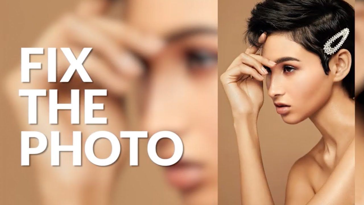
There’s a specific failure mode I see constantly in beauty edits, including some of my own early ones. The retoucher fixes everything they were asked to fix, the skin looks clean, the colors are balanced, and yet something about the image feels off. The viewer’s eye wanders to the wrong place. That’s not a technical problem. It’s a compositional one, and no amount of frequency separation will solve it. What solves it is learning to think about visual weight and flow after the camera has already captured the shot.
Watch the full tutorial on YouTube
In this Visual Education tutorial, the instructor works through a beauty portrait submitted by Miami-based photographer Ian Jacob as part of a member challenge. The image is genuinely good to start with, which is exactly why this walkthrough is so useful. It’s not a rescue job. It’s a refinement exercise, and the decisions made along the way reveal a retouching philosophy I find myself coming back to regularly: every adjustment should either strengthen the focal point or stop competing with it.
Step 1: Identify What’s Fighting for Attention
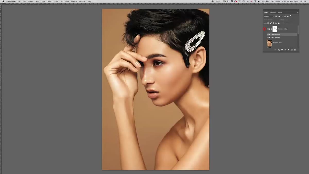 Before and after comparison showing hand vs. face prominence
Before touching a single slider, the instructor does something that separates thoughtful retouching from mechanical retouching. He looks at the original and asks what the image is actually about. In this case, it’s a beauty portrait, so the face should dominate. But the hand placement in the frame is pulling significant visual weight away from the face. The skin tone on the hand, its position in the composition, and its overall brightness are all making it compete with the subject’s face.
Before and after comparison showing hand vs. face prominence
Before touching a single slider, the instructor does something that separates thoughtful retouching from mechanical retouching. He looks at the original and asks what the image is actually about. In this case, it’s a beauty portrait, so the face should dominate. But the hand placement in the frame is pulling significant visual weight away from the face. The skin tone on the hand, its position in the composition, and its overall brightness are all making it compete with the subject’s face.
Get into this habit before you open any panels. Make a list of what’s drawing your eye and whether each of those things is supposed to. In this image, the hand is not supposed to. That one observation drives almost every decision that follows.
Step 2: Reshape for Flow, Not Perfection
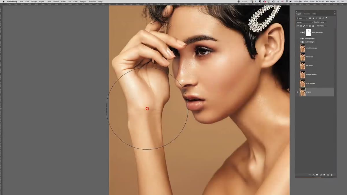 Warp or liquify adjustment on the wrist and thumb area
The first actual edit is a reshape of the wrist area, specifically a bump at the base of the thumb that the instructor describes as visually uncomfortable. This isn’t about making the model’s hand look thinner or more idealized. It’s about removing a shape that interrupts the flow of the composition. A small distortion at the wrist, a refinement along the jawline to make it read more cleanly, subtle adjustments to the hair outline, and a tweak to the shoulder silhouette are all handled in separate layers, each labeled clearly.
Warp or liquify adjustment on the wrist and thumb area
The first actual edit is a reshape of the wrist area, specifically a bump at the base of the thumb that the instructor describes as visually uncomfortable. This isn’t about making the model’s hand look thinner or more idealized. It’s about removing a shape that interrupts the flow of the composition. A small distortion at the wrist, a refinement along the jawline to make it read more cleanly, subtle adjustments to the hair outline, and a tweak to the shoulder silhouette are all handled in separate layers, each labeled clearly.
The practical takeaway here is to do your reshaping work in isolated layers grouped by body region. When a client asks you to dial back a change, you can reduce the opacity of just that layer without disturbing anything else. The instructor treats each reshape as a semi-permanent decision rather than a final one, which is the right approach for client work.
Step 3: Tame Highlights That Are Too Hot
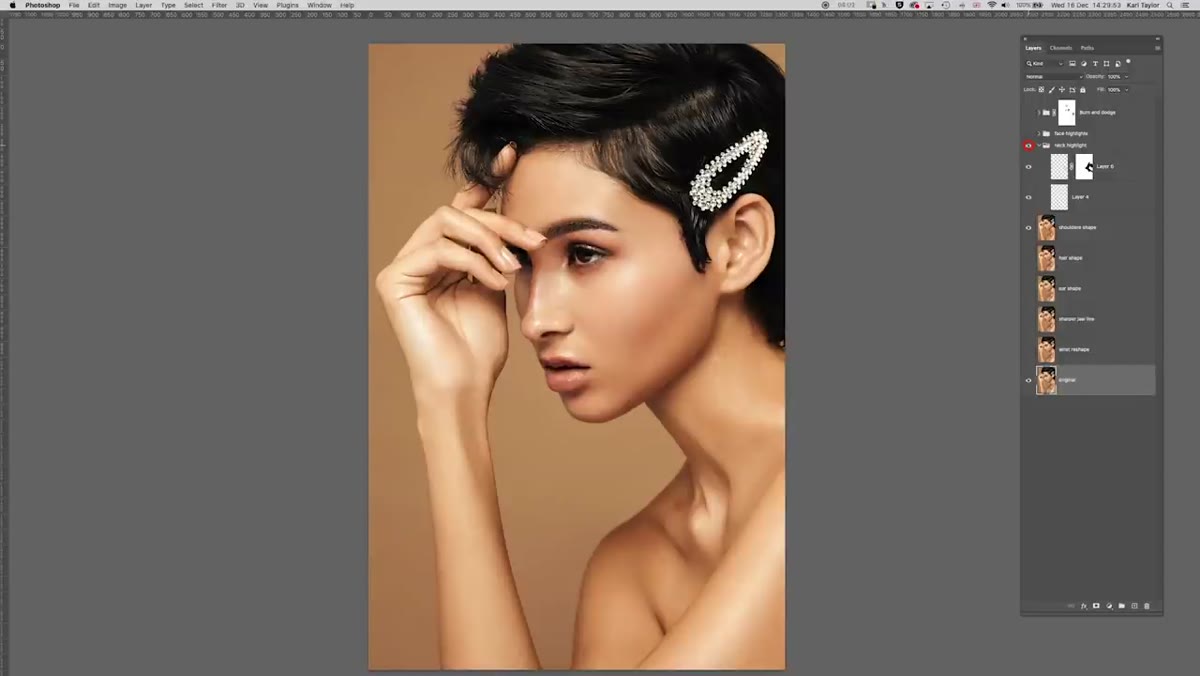 Neck highlight layer toggled on showing brightness reduction
The neck in the original has a sheen that the photographer likely intended, but in the context of a beauty portrait focused on the face, it’s another element pulling attention downward. The instructor addresses this with a dedicated layer targeting the neck highlight, reducing its intensity rather than eliminating it entirely. This distinction matters. Removing a highlight completely can flatten the dimension of the skin and make the edit feel heavy-handed. Reducing it gives you the best of both outcomes.
Neck highlight layer toggled on showing brightness reduction
The neck in the original has a sheen that the photographer likely intended, but in the context of a beauty portrait focused on the face, it’s another element pulling attention downward. The instructor addresses this with a dedicated layer targeting the neck highlight, reducing its intensity rather than eliminating it entirely. This distinction matters. Removing a highlight completely can flatten the dimension of the skin and make the edit feel heavy-handed. Reducing it gives you the best of both outcomes.
The same principle applies to the face highlights, which in the original are quite strong across several areas. Rather than painting over them with a flat tone, the instructor removes them on a separate layer and leaves the opacity adjustable. If the photographer wanted to restore some of that luminosity, it’s a single slider move. Always build in the ability to be wrong.
Step 4: Darken and Desaturate the Hand
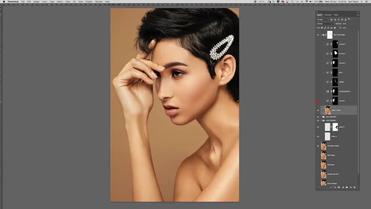 Burn layer and saturation adjustment targeting the hand
This is the step that does the most compositional heavy lifting. Two separate adjustments target the hand: a burn layer to reduce its overall brightness and a saturation reduction to pull the warmth and color out of it. Together, these push the hand toward neutral and dark, which is where you want elements that aren’t the focal point of a beauty portrait to live.
Burn layer and saturation adjustment targeting the hand
This is the step that does the most compositional heavy lifting. Two separate adjustments target the hand: a burn layer to reduce its overall brightness and a saturation reduction to pull the warmth and color out of it. Together, these push the hand toward neutral and dark, which is where you want elements that aren’t the focal point of a beauty portrait to live.
Using both luminosity and saturation together is more effective than either alone. A bright desaturated hand still reads as a graphic element. A saturated darkened hand still has color energy that draws the eye. Strip both at once and the hand visually recedes. You’re not removing it from the image, you’re subordinating it, which is exactly what the composition needed.
Step 5: Refine the Face and Neck with Dodge and Burn
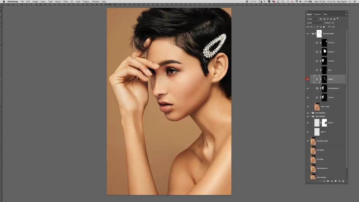 Dodge and burn layers applied to face and neck areas
With the hand quieted down, the face needs to step up to fill the visual leadership role. The instructor uses a series of dodge and burn layers at low opacity, around 20 percent, to refine the contouring of the face and neck. These aren’t dramatic changes. They’re the kind of adjustments that you can barely see individually but that collectively make the face feel more three-dimensional and more present in the frame.
Dodge and burn layers applied to face and neck areas
With the hand quieted down, the face needs to step up to fill the visual leadership role. The instructor uses a series of dodge and burn layers at low opacity, around 20 percent, to refine the contouring of the face and neck. These aren’t dramatic changes. They’re the kind of adjustments that you can barely see individually but that collectively make the face feel more three-dimensional and more present in the frame.
Work your dodge and burn layers in soft light blending mode on a neutral gray fill, and keep your brush opacity low, between 5 and 15 percent for most passes. Build gradually. The goal on a face is never a single decisive stroke but a cumulative shift that reads as natural light rather than retouching.
What I’d Add From My Own Workflow
One thing the tutorial doesn’t address explicitly, but that I always layer on top of this kind of work, is a final vignette pass that’s specific to the subject’s face rather than the frame edge. A standard radial gradient vignette centered on the frame can actually work against you if the subject’s face isn’t centered. Instead, I draw my vignette centered on the eyes, keeping it subtle, maybe 10 to 15 percent opacity in multiply mode. It reinforces everything the dodge, burn, and hand darkening are already doing and gives the whole edit a sense of intentionality that clients respond to even if they can’t name why.
The single most important idea in this workflow isn’t any individual technique. It’s the mindset that retouching is a form of visual direction. Every adjustment either tells the viewer’s eye where to go or gets out of the way. When you approach a beauty portrait with that question, “what am I redirecting, and where to?” the decisions about what to reshape, what to dim, and what to deepen become much clearer.
Watch the full tutorial on YouTube to see the complete before and after and follow along with the layer stack in real time.
Comments (4)
This is going in my reference folder. Incredibly useful.
Tried this technique this morning. Game changer for real.
This is the kind of content that keeps me coming back.
Great breakdown. The step-by-step approach really helps.
Leave a Comment