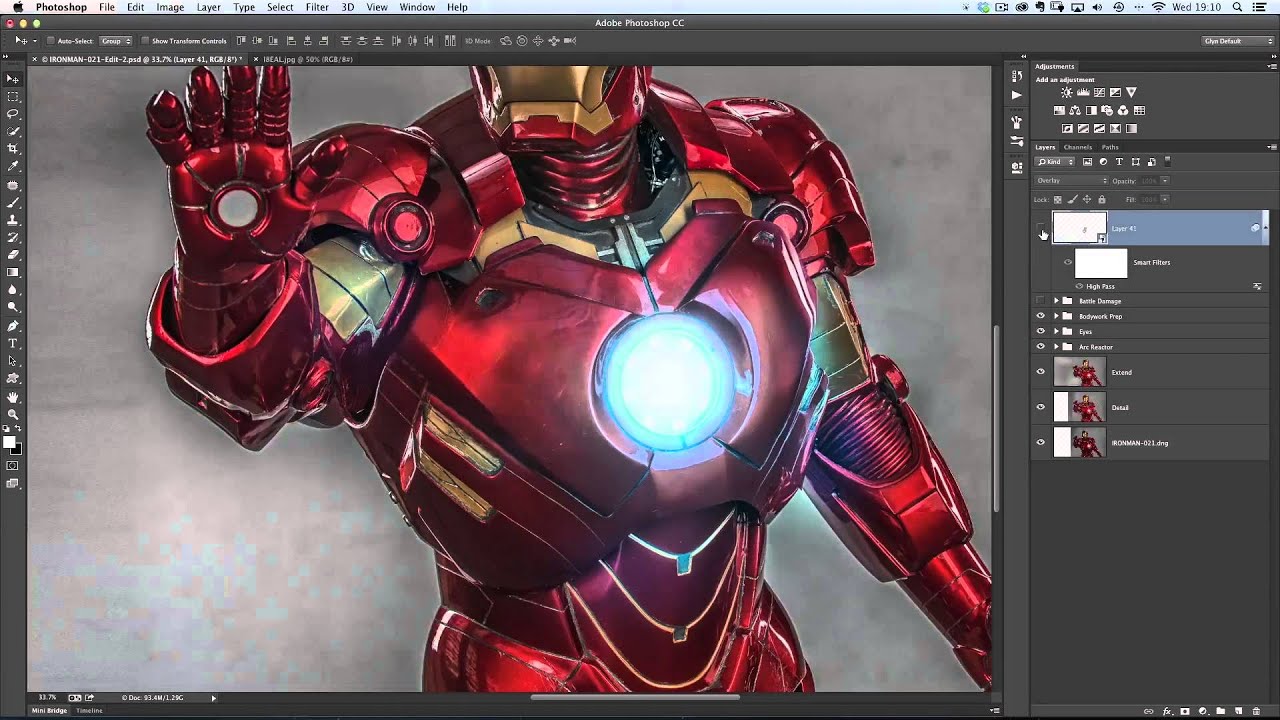
There is a specific kind of client feedback that lives rent-free in your head for years. Mine came early in my retouching career, when someone looked at a portrait I had spent two hours on and said the skin looked “plastic.” They were right. I had been smoothing and blurring with no real system, no understanding of what made skin look like skin rather than a vinyl mask. That moment sent me on a long search for techniques that held up under scrutiny, and frequency separation became the answer I kept coming back to. So when I sat down with this KelbyOne episode, featuring instructor Glenn Dewis walking through frequency separation alongside a genuinely clever 3D text trick, I took notes. Watch the full tutorial on YouTube
The episode is presented by Cory Barker and covers two distinct segments. The first is a fast, creative 3D technique for splitting extruded text into individually moveable pieces. The second is Glenn Dewis’s frequency separation walkthrough, which is the part I know will be most relevant to beauty retouchers reading this. I want to walk through both, because even if you never use the 3D effect on a client project, understanding how Photoshop thinks about paths and extrusion depth makes you a more confident user overall.
Step 1: Convert Your Text Layer to a Work Path
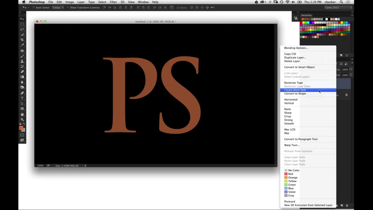 Right-click menu showing “Create Work Path” on text layer
Start with a simple text layer on your canvas. Right-click directly on the layer and choose “Create Work Path.” This converts the letterforms from editable type into vector path data that Photoshop’s 3D engine can read. At this stage, create a new layer beneath and drop a solid color fill on it so you can actually see what the path is doing. Gray against gray is a fast way to lose your place, so pick something with contrast.
Right-click menu showing “Create Work Path” on text layer
Start with a simple text layer on your canvas. Right-click directly on the layer and choose “Create Work Path.” This converts the letterforms from editable type into vector path data that Photoshop’s 3D engine can read. At this stage, create a new layer beneath and drop a solid color fill on it so you can actually see what the path is doing. Gray against gray is a fast way to lose your place, so pick something with contrast.
Step 2: Draw Subtractive Paths Across the Letters
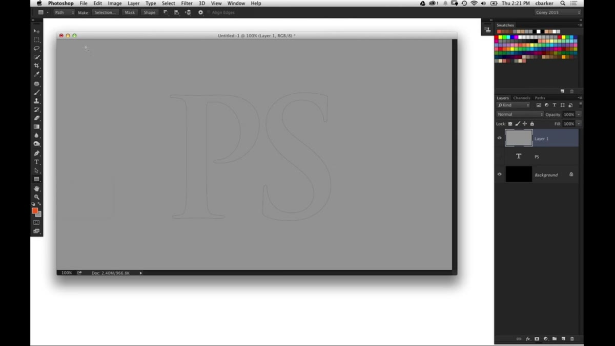 Rectangular shape tool drawing thin horizontal lines across letter paths
Switch to the Rectangle Tool and look at the Options Bar carefully before you draw anything. You need two settings active: draw mode set to “Path,” and the combine mode set to “Subtract From Shape.” With those in place, draw several thin horizontal lines across your letterforms. These strips do not add to the shape. They punch holes through it, like scoring a slab of clay before you break it apart. Think of them as the cut lines on a sheet of perforated stamps. Three or four lines at varied heights across the text creates the illusion of the letters being sliced into horizontal segments.
Rectangular shape tool drawing thin horizontal lines across letter paths
Switch to the Rectangle Tool and look at the Options Bar carefully before you draw anything. You need two settings active: draw mode set to “Path,” and the combine mode set to “Subtract From Shape.” With those in place, draw several thin horizontal lines across your letterforms. These strips do not add to the shape. They punch holes through it, like scoring a slab of clay before you break it apart. Think of them as the cut lines on a sheet of perforated stamps. Three or four lines at varied heights across the text creates the illusion of the letters being sliced into horizontal segments.
Step 3: Select All Paths and Apply a Color Fill Before Extruding
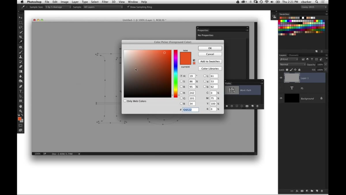 All paths selected, color fill dialog open in Photoshop
Select all the path elements together, then apply a solid color fill to the combined shape. This matters more than it sounds. If you go into the 3D extrusion step while your shape is sitting in a flat gray, it is difficult to read the depth and the cut lines in the resulting 3D view. A saturated color gives you a visual anchor. Once the fill is in place, go to the 3D menu and choose “New 3D Extrusion from Selected Path.” Photoshop will render the filled regions as solid 3D mass while the subtracted strips become actual voids cutting straight through the extruded object.
All paths selected, color fill dialog open in Photoshop
Select all the path elements together, then apply a solid color fill to the combined shape. This matters more than it sounds. If you go into the 3D extrusion step while your shape is sitting in a flat gray, it is difficult to read the depth and the cut lines in the resulting 3D view. A saturated color gives you a visual anchor. Once the fill is in place, go to the 3D menu and choose “New 3D Extrusion from Selected Path.” Photoshop will render the filled regions as solid 3D mass while the subtracted strips become actual voids cutting straight through the extruded object.
Step 4: Adjust Extrusion Depth and Reset the Camera View
 3D extrusion depth slider being reduced in Properties panel
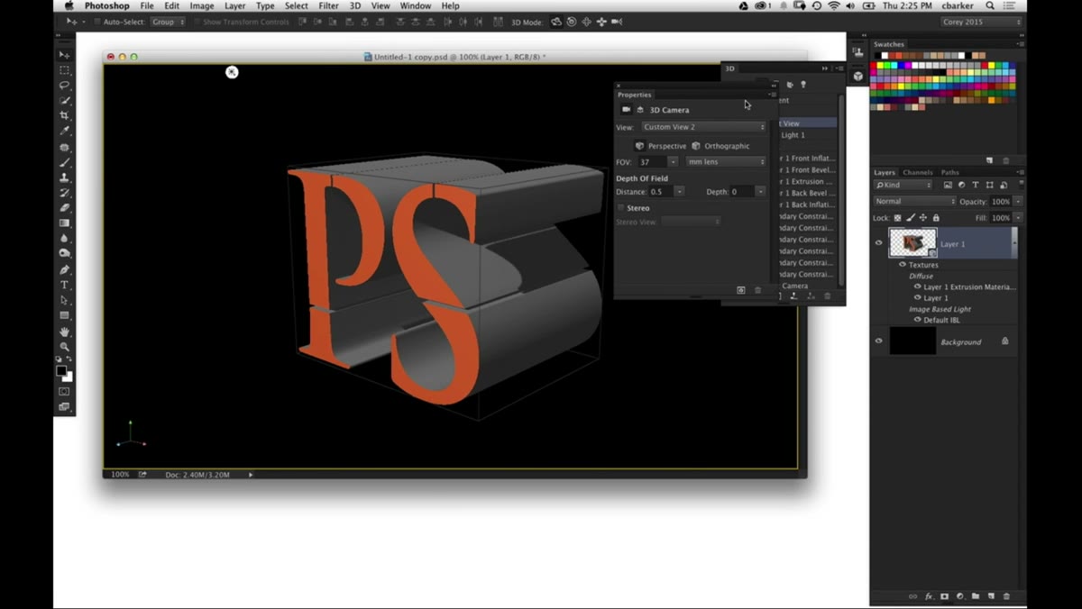
The default extrusion depth is usually more than you want for a clean, graphic look. Pull it back in the Properties panel until the text has a sturdy but not theatrical depth. Then use the default camera option to snap the view back to a front-facing angle. From this perspective, the sliced gaps between letter segments become clearly visible, and the overall effect reads immediately as intentional rather than glitchy.
3D extrusion depth slider being reduced in Properties panel
The default extrusion depth is usually more than you want for a clean, graphic look. Pull it back in the Properties panel until the text has a sturdy but not theatrical depth. Then use the default camera option to snap the view back to a front-facing angle. From this perspective, the sliced gaps between letter segments become clearly visible, and the overall effect reads immediately as intentional rather than glitchy.
Step 5: Split the Extrusion Into Separate 3D Objects
 3D menu open with “Split Extrusion” option highlighted
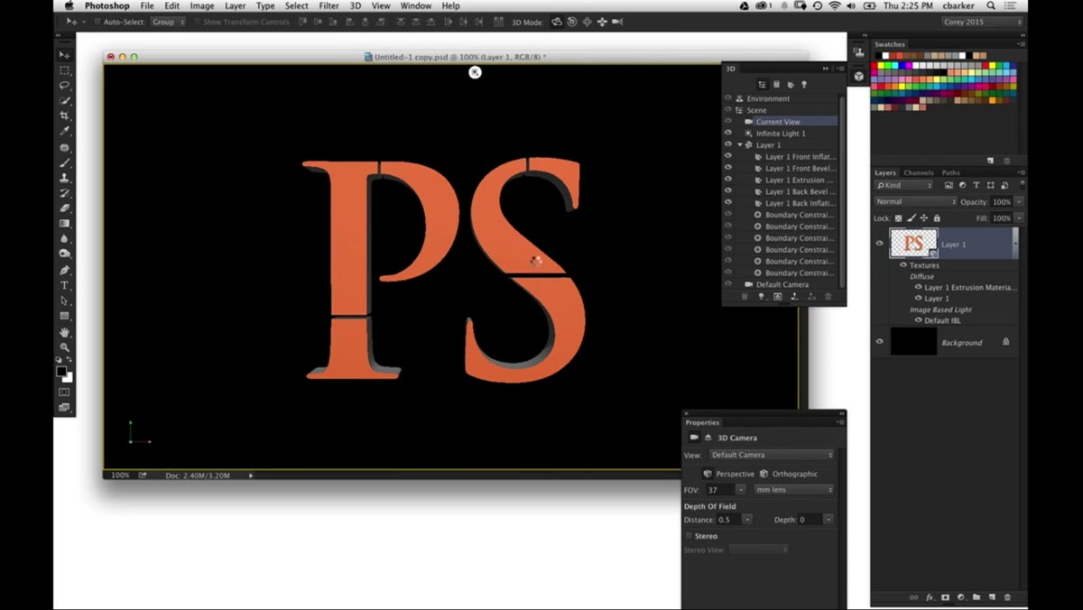
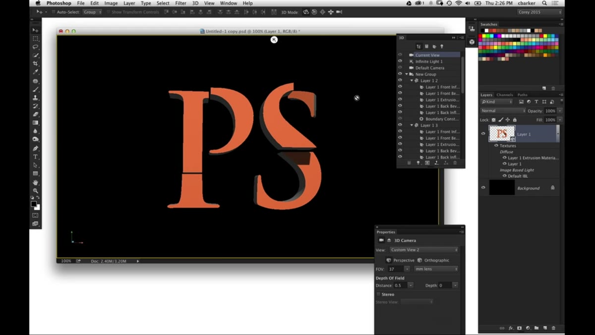
This is the step that makes the whole technique worth knowing. Go back to the 3D menu and choose “Split Extrusion.” What this does is take every disconnected piece of the 3D object, meaning every segment of letter that is not physically touching another segment, and turns it into its own independent 3D element. They still live inside the same 3D scene, so they share the same light environment and ground plane, but you can now select and move each slice individually. You can push individual letter segments back in space, rotate a single slice on its axis, or stagger them in a cascade without affecting their neighbors. That flexibility is where the creative potential opens up.
3D menu open with “Split Extrusion” option highlighted
This is the step that makes the whole technique worth knowing. Go back to the 3D menu and choose “Split Extrusion.” What this does is take every disconnected piece of the 3D object, meaning every segment of letter that is not physically touching another segment, and turns it into its own independent 3D element. They still live inside the same 3D scene, so they share the same light environment and ground plane, but you can now select and move each slice individually. You can push individual letter segments back in space, rotate a single slice on its axis, or stagger them in a cascade without affecting their neighbors. That flexibility is where the creative potential opens up.
Step 6: Apply Frequency Separation for Skin Retouching
 Glenn Dewis demonstrating frequency separation layer setup on portrait
Glenn Dewis takes over the second half of the episode with frequency separation, and his setup process is clean and worth replicating. Duplicate your background layer twice. On the lower copy, apply a Gaussian Blur strong enough to completely remove texture from the skin while keeping the underlying tones and color transitions intact. On the upper copy, go to Image, Apply Image, and reference the blurred layer with the Subtract blending mode. Set the Scale to 2 and Offset to 128. This mathematically isolates the surface texture from the underlying color and tone information.
Glenn Dewis demonstrating frequency separation layer setup on portrait
Glenn Dewis takes over the second half of the episode with frequency separation, and his setup process is clean and worth replicating. Duplicate your background layer twice. On the lower copy, apply a Gaussian Blur strong enough to completely remove texture from the skin while keeping the underlying tones and color transitions intact. On the upper copy, go to Image, Apply Image, and reference the blurred layer with the Subtract blending mode. Set the Scale to 2 and Offset to 128. This mathematically isolates the surface texture from the underlying color and tone information.
Set the upper texture layer’s blending mode to Linear Light. Now you have two layers that together reconstruct the original image perfectly, but independently they let you work on texture and tone without touching each other. Use the Healing Brush or Clone Stamp exclusively on the lower color layer to fix uneven skin tone, redness, or discoloration. Use the texture layer only for structural skin detail work. The result is retouching that reads as real skin because the pore structure and fine detail are preserved while the underlying evenness is corrected.
A Note From My Own Frequency Separation Practice
I spent close to a year refining my frequency separation workflow before it stopped feeling mechanical and started feeling intuitive. The single mistake I see most often, including in my own early work, is using too large a Gaussian Blur on the color layer. If you blur too much, the color information starts bleeding across facial features and you get a halo effect around the nose or lips when you paint on that layer. I now do a quick test: zoom in to 100 percent on the blurred layer alone and check that skin tones still transition naturally across the cheeks. The texture should be gone, but the gradients should still follow the face’s contours. If the blur has flattened everything into a flat wash of color, back off the radius. For most portraits shot at a flattering distance, somewhere between 4 and 8 pixels is the sweet spot, though every image will be slightly different.
The single most useful thing this episode reinforced for me is that both techniques, the 3D split and frequency separation, work on the same principle. You separate something into components that would otherwise be stuck together, work on each component independently, and then let Photoshop recombine them in the final render. Understanding that logic makes both workflows easier to remember and easier to adapt when something goes sideways mid-edit. Watch the full tutorial on YouTube to see Glenn Dewis and Cory Barker demonstrate both techniques in real time.
Comments (2)
My workflow just got 10x faster. Not even kidding.
This is going in my reference folder. Incredibly useful.
Leave a Comment