A few years into freelancing, I had a client send back a batch of beauty shots with one word in the subject line: “More.” She wanted more brightness, more color, more life in the eyes. I’d already dodged the irises, boosted the whites, and painted in a catch light. The eyes looked like something out of an animated film. I sat back from my (perpetually lowered) standing desk, made a fresh cup of green tea, and realized the problem wasn’t that I hadn’t done enough. It was that I’d been doing everything in the wrong order, on the wrong layers, chasing brightness when the real issue was depth.
Eye enhancement is one of those techniques that retouchers either oversell or under-develop. The oversellers give you that glassy, contact-lens-ad stare that reads as fake the moment you see it. The under-developers leave the eyes flat, like the subject photographed behind a screen door. The goal is something quieter and harder to achieve: eyes that look like the best version of themselves on the best day of their life.
Why Flat Eyes Are a Lighting Problem Disguised as a Retouching Problem
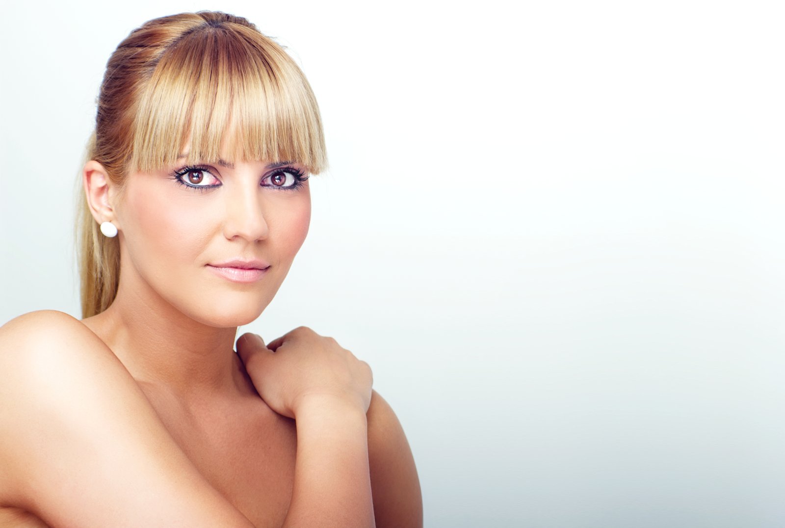
Before we open Photoshop, it helps to understand why eyes go flat in the first place. The eye is a sphere. Its surface curves away from the light source, which means the iris has natural variation in tone, from a highlight zone nearest the key light to a shadow zone on the opposite side. When that gradient is subtle or absent because of flat on-camera lighting, diffused studio setups, or slight exposure compensation during the shoot, the eye loses its three-dimensional quality. We’re not manufacturing something fake when we restore it. We’re recovering what the camera failed to capture.
The whites of the eye carry a similar issue. The sclera isn’t bright white. It has cool blue-gray tones in the corners, a slight warmth near the iris, and vein detail that, when present in moderation, reads as life. When retouchers nuke all of that to achieve “clean whites,” the eye looks like a ping-pong ball. The vein work and tonal variation are doing structural work we can’t afford to lose.
The Layer Stack I Use on Every Portrait
I work in Photoshop and my go-to eye enhancement stack has four layers. First, a Curves adjustment layer clipped to a group containing a rough selection of the eye area. I pull the midtones up slightly, maybe a 10-to-15 point lift at the center of the curve, then add a slight S-curve by pulling the shadows down 8 points. This recovers contrast without blowing out the highlights.
Second, a Hue/Saturation layer clipped inside the same group. I increase saturation by 15 to 20 points on the master channel, then shift the hue 3 to 5 degrees toward the color I want to enhance, whether that’s the green in a hazel iris or the blue in a gray one. Small moves. If you can see the color change happening in real time as you drag the slider, you’ve probably already gone too far.
Third, a blank layer set to Overlay mode at 40% opacity for dodge and burn on the iris. I use a soft brush at 10% opacity with white to lift the zone nearest the catch light, and black to deepen the opposite edge. This is where the sphere effect actually comes from. It takes about four minutes and makes more difference than every other step combined.
Fourth, and this one people skip: a blank Multiply layer at 20 to 25% opacity to slightly deepen the limbal ring, which is the dark circle at the outer edge of the iris. Research in visual perception consistently shows that a defined limbal ring reads as youth and vitality. You don’t need to paint it from scratch. You just need to make sure it didn’t wash out in post-processing.
Handling the Whites Without Destroying Them
I never use a blanket Selective Color or Hue/Saturation pass to whiten the sclera across the whole eye. Instead, I use a Curves layer targeting only the whites, pulled into a luminosity selection (Select, Color Range, set to Highlights with a fuzziness of around 40). I lift the whites by about 12 points and immediately reduce the layer opacity to 60%. Then I mask out the inner corners and any vein structures I want to keep for realism. The result is whiter-looking eyes that still look wet, still look real.
For visible redness, I use Hue/Saturation targeted to the red channel. I pull the saturation down 20 to 30 points and sometimes shift the hue 5 degrees toward orange to neutralize the pink cast without going gray. I mask this carefully to avoid touching the pink inner corner, which is anatomically correct and needs to stay.
The Moment That Recalibrated Everything
Early in my retouching career, I was so focused on making eyes bright that I forgot to make them believable. A client once told me, as diplomatically as she could manage, that her portrait looked “a little bit like a video game character.” She wasn’t wrong. I still have that file. I keep it in a folder called “Before I Knew Better” and I open it maybe once a year, the same way some people keep an old journal entry to remember who they used to be.
What changed was learning to look at reference photographs of real eyes under great light and asking: what is the light actually doing here? The answer is almost never “making everything uniformly brighter.” It’s creating contrast, shaping the sphere, catching on the rim of the iris. That question redirected my entire approach.
When to Stop Before You Overshoot
The most reliable method I’ve found for knowing when to stop is to flip a before-and-after comparison and look at the “before” version first. If the “after” immediately reads as retouched rather than natural, something is too intense, and the culprit is almost always saturation or the dodge layer opacity. Drop both by 20% and check again.
The eyes are where a viewer’s gaze lands within the first 200 milliseconds of looking at a portrait. Every second you spend getting that area right is worth ten seconds spent anywhere else on the face, and the work that reads as invisible is almost always the work that took the longest to learn.
Comments (1)
My workflow just got 10x faster. Not even kidding.
Leave a Comment