There’s a particular kind of frustration that every self-taught retoucher knows. You find a tutorial with gorgeous results, you follow along as carefully as you can, and what you end up with looks nothing like the final image. Not even close. The gap between “here’s the concept” and “here’s exactly how to do it” is where most instructional content quietly falls apart. I spent years filling that gap by trial and error, and I have a hard drive full of over-processed, plastic-looking portraits to prove it. So when a teaching approach promises to close that gap completely, I pay attention.
In this KelbyOne tutorial, Scott Kelby explains the philosophy behind his book “Light It. Shoot It. Retouch It.” (2nd Edition), and honestly, the philosophy is the technique. Watch the full tutorial on YouTube. Kelby’s entire argument is that most portrait instruction fails because it withholds the specifics, the exact power settings, the precise distances, the actual camera values. What gets presented instead is an approximation dressed up as a lesson. His answer is radical transparency: every measurement, every setting, every step of the Lightroom and Photoshop workflow, shared in full.
What follows is my breakdown of how that workflow is structured, what each phase actually involves, and one place where I’d push the approach a step further based on my own time in the retouching chair.
Step 1: Study the Contact Sheet Before You Touch a Single Slider
 Grid of portrait shoot images shown before final selection
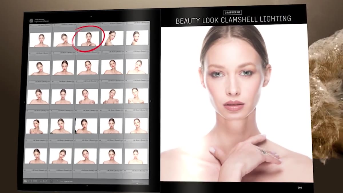
Before any editing begins, Kelby presents a full grid of images from the shoot. This isn’t just organizational housekeeping. Looking at a contact sheet trains your eye to see what actually changed across frames, how the light shifted, how the subject’s expression and posture varied. When you identify the final image from a grid rather than opening one file in isolation, you’re making a comparative judgment, which is almost always a better one.
Grid of portrait shoot images shown before final selection
Before any editing begins, Kelby presents a full grid of images from the shoot. This isn’t just organizational housekeeping. Looking at a contact sheet trains your eye to see what actually changed across frames, how the light shifted, how the subject’s expression and posture varied. When you identify the final image from a grid rather than opening one file in isolation, you’re making a comparative judgment, which is almost always a better one.
In practice, this means importing your full shoot into Lightroom before you rate or reject anything, and doing your first pass at a zoom level where you can see multiple images at once. In the Library module, use the Grid view (press G) and set your thumbnail size large enough to read expressions clearly. Flag your selects with P before you ever open the Develop module. This single habit will save you from over-editing a second-choice image.
Step 2: Use the Behind-the-Scenes Reference Images to Understand the Light Before You Edit It
 Overhead diagram showing camera, subject, and light positions
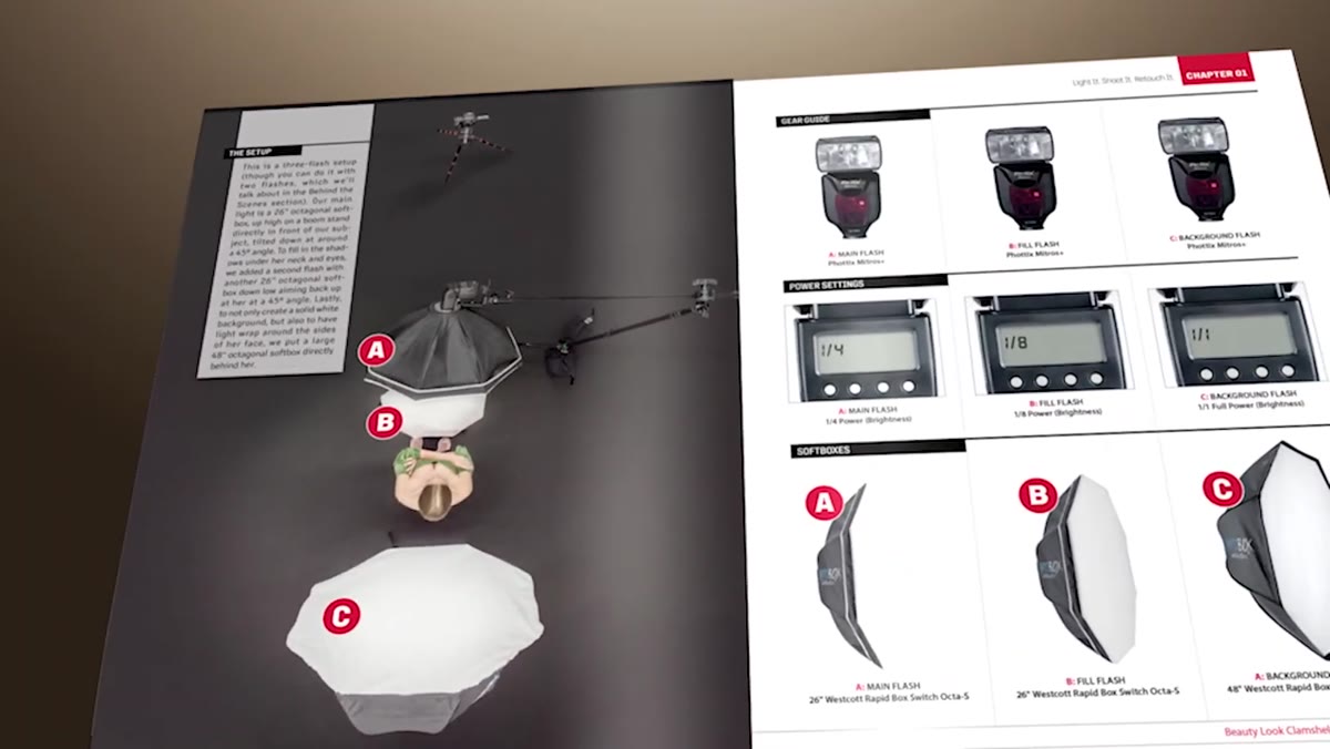
Kelby includes overhead and multi-angle behind-the-scenes photographs of every setup, with exact measurements: how far the camera sits from the subject, how high the light is from the floor, how far the light is from the subject’s face. For editors, this is more useful than it might first seem.
Overhead diagram showing camera, subject, and light positions
Kelby includes overhead and multi-angle behind-the-scenes photographs of every setup, with exact measurements: how far the camera sits from the subject, how high the light is from the floor, how far the light is from the subject’s face. For editors, this is more useful than it might first seem.
When you understand where the light source was physically placed, you can make smarter retouching decisions. A light positioned high and to camera-left creates a specific shadow pattern under the nose and chin. If you’re dodging and burning later in Photoshop, you want to work with that geometry, not against it. Pull up your reference shot on a second monitor or your phone before you start the Develop module. Let the physics of the shoot guide your hand.
Step 3: Build Your Lightroom Edit Around the Light, Not Around the Histogram
 Lightroom Develop module with exposure and tone controls visible
The Lightroom phase in Kelby’s workflow isn’t about correcting a bad exposure. It’s about enhancing what the light was already doing. That’s a meaningful distinction. Start with white balance and confirm it matches the mood of the setup. Then work through the tone panel in this order: Exposure first to set overall brightness, then Highlights down to recover any blown areas near the light source, then Shadows up just enough to open the darker side of the face without flattening the depth.
Lightroom Develop module with exposure and tone controls visible
The Lightroom phase in Kelby’s workflow isn’t about correcting a bad exposure. It’s about enhancing what the light was already doing. That’s a meaningful distinction. Start with white balance and confirm it matches the mood of the setup. Then work through the tone panel in this order: Exposure first to set overall brightness, then Highlights down to recover any blown areas near the light source, then Shadows up just enough to open the darker side of the face without flattening the depth.
Resist the urge to over-brighten. One of the most common mistakes I see in workshop students is pushing Exposure and Whites until the image looks vivid on screen, which often means it’s already blown out in the skin. After your basic tone adjustments, check your work using the soft-proof view. A portrait that reads well at 1:1 zoom in the Develop module is the one worth taking into Photoshop.
Step 4: Move Into Photoshop for All Skin and Detail Work
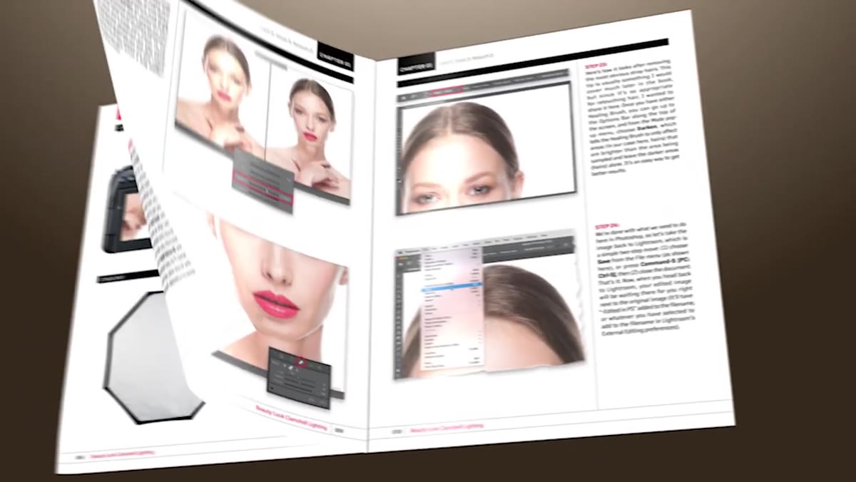 Photoshop open with portrait layer ready for retouching
Kelby is specific that the retouching, meaning actual skin work, happens in Photoshop rather than Lightroom, and that’s the correct call. Lightroom’s healing tools are useful for simple blemish removal, but the moment you need to work with texture, depth, or localized color correction, you need layers.
Photoshop open with portrait layer ready for retouching
Kelby is specific that the retouching, meaning actual skin work, happens in Photoshop rather than Lightroom, and that’s the correct call. Lightroom’s healing tools are useful for simple blemish removal, but the moment you need to work with texture, depth, or localized color correction, you need layers.
Open your image from Lightroom as a Smart Object so you can return to your raw adjustments if anything looks off. Then duplicate the background layer before you touch anything. Name your layers as you go. I name mine after films (“Softlight - Her”, “Frequency High - Arrival”) which sounds eccentric but means I can read my layer stack like a script.
Step 5: Retouch Step by Step, in the Order the Image Demands
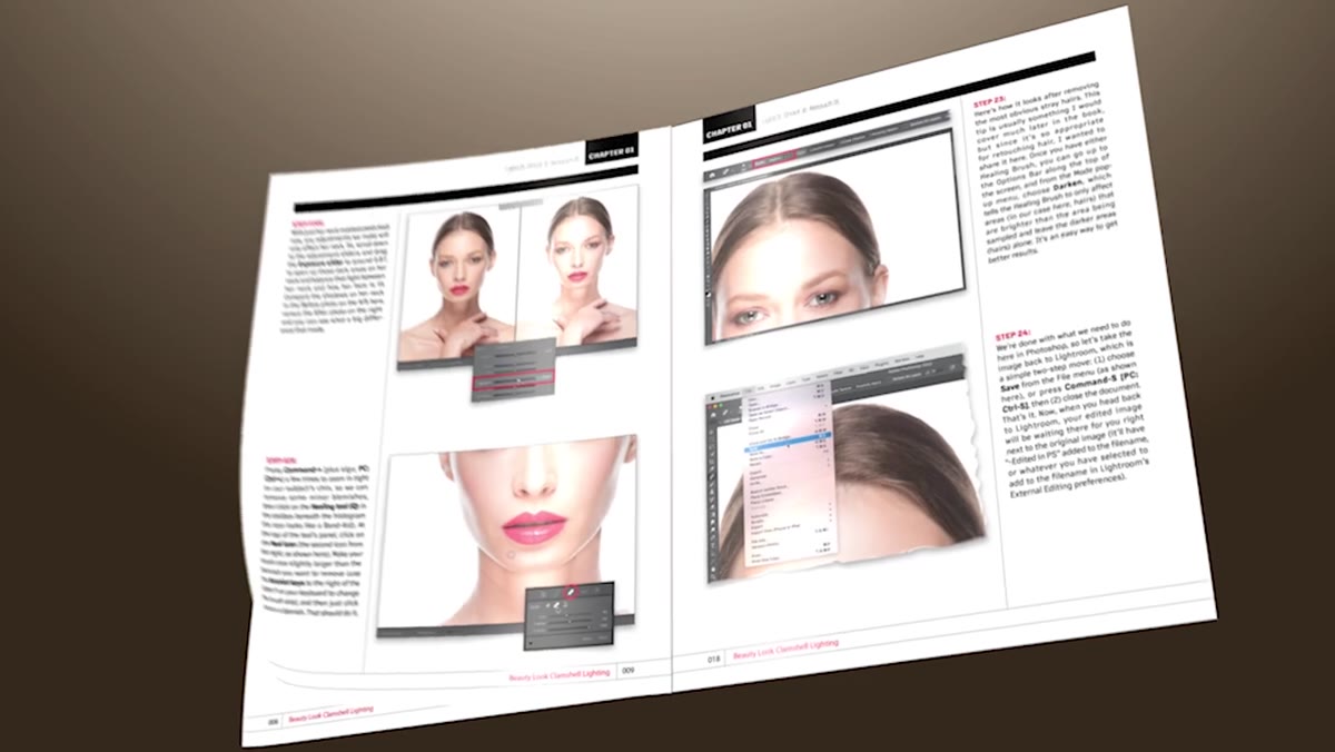 Portrait retouching steps applied sequentially in Photoshop
Kelby’s workflow moves through retouching in a logical sequence rather than jumping around. Start with removal of temporary distractions: stray hairs, blemishes, anything that wouldn’t be there on a different day. Use the Healing Brush set to Current & Below on a blank layer, sampling from nearby skin texture. Then address anything structural: uneven skin tone, shadows under eyes, asymmetry in the lighting that doesn’t serve the image.
Portrait retouching steps applied sequentially in Photoshop
Kelby’s workflow moves through retouching in a logical sequence rather than jumping around. Start with removal of temporary distractions: stray hairs, blemishes, anything that wouldn’t be there on a different day. Use the Healing Brush set to Current & Below on a blank layer, sampling from nearby skin texture. Then address anything structural: uneven skin tone, shadows under eyes, asymmetry in the lighting that doesn’t serve the image.
Only after the cleanup work is done should you consider any skin-smoothing techniques. Frequency separation, if you use it, belongs here. Keep the texture layer completely untouched and work only on the color/tone layer to smooth uneven areas. The goal is skin that looks like good skin, not skin that looks like it was painted. That distinction took me an embarrassingly long time to internalize.
Step 6: Do a Final Review at Print Size, Not Screen Size
 Final processed portrait image shown at completion
The last step before delivering any portrait is a zoom-level check. View your image at the size it will actually be used. A headshot going on LinkedIn needs to read at a small square. A campaign image going on a billboard needs to hold up at 1:1 or larger. Skin that looks smooth at 25% zoom can reveal halo artifacts from over-sharpening when you zoom to 100%.
Final processed portrait image shown at completion
The last step before delivering any portrait is a zoom-level check. View your image at the size it will actually be used. A headshot going on LinkedIn needs to read at a small square. A campaign image going on a billboard needs to hold up at 1:1 or larger. Skin that looks smooth at 25% zoom can reveal halo artifacts from over-sharpening when you zoom to 100%.
Do this review on a calibrated monitor if you have one, or at minimum with your screen brightness set to a neutral level. Then flatten, export, and resist the urge to open it again.
One Thing I’d Add: Practice the Whole Sequence on the Same Image Twice
Kelby’s workflow includes downloadable practice images, which is genuinely generous. My suggestion is to work through the full sequence once following his steps exactly, then close everything and do it again from scratch without looking at your notes. The second pass is where you actually learn it. Muscle memory in Photoshop is built through repetition, not through watching, and there’s a meaningful difference between understanding a technique and being able to execute it under deadline pressure at 11pm for a client whose feedback window closes at midnight.
The single most important idea in Kelby’s approach is also the simplest: withholding information doesn’t make you a better teacher, it just makes your students more frustrated. A fully transparent workflow, with real measurements and real settings, is what actually moves people forward. If you’re trying to level up your portrait retouching and you’re tired of tutorials that leave too much to interpretation, this is worth your time. Watch the full tutorial on YouTube and see how the framework holds together from shoot to final image.
Comments
Leave a Comment