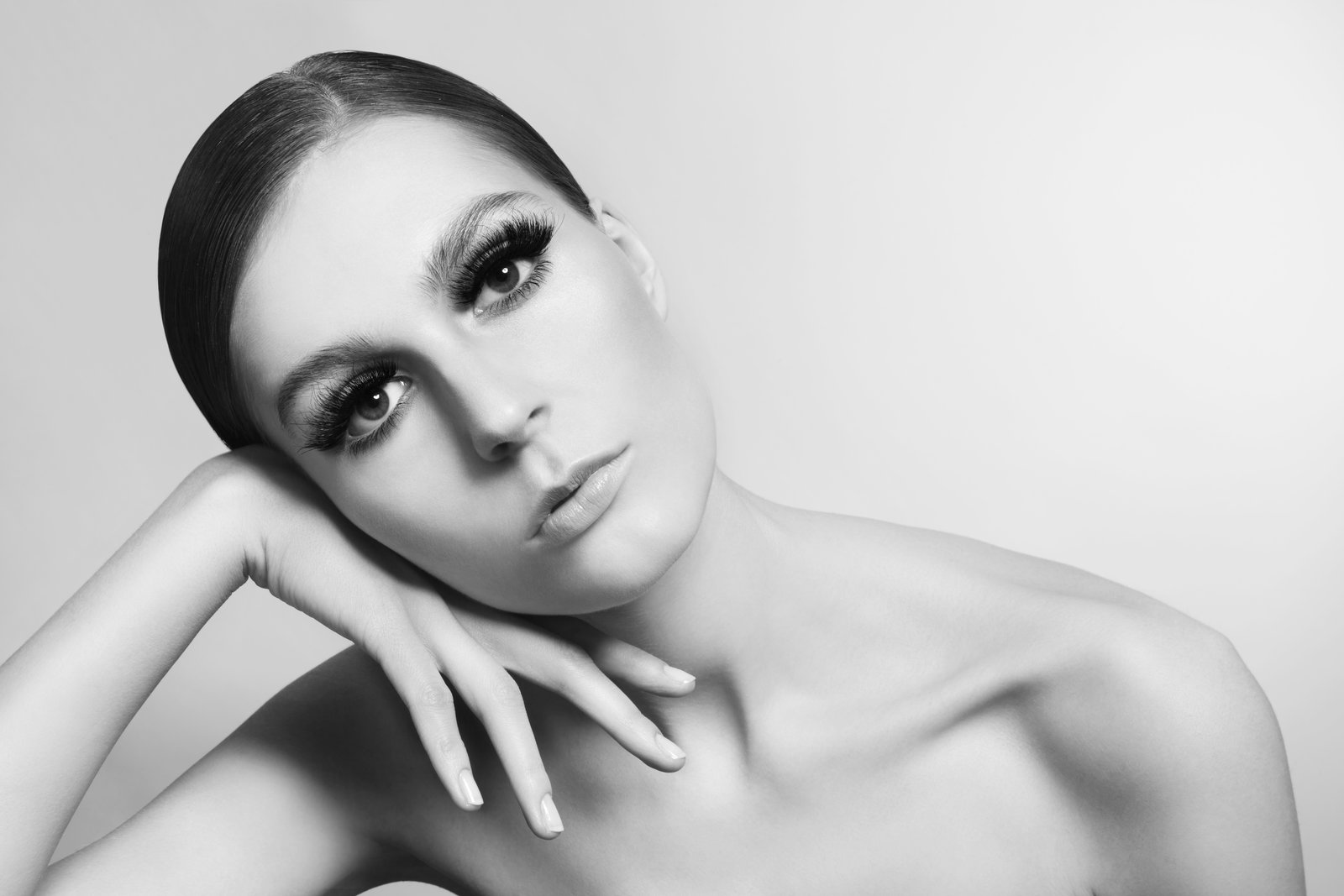
A few years into my retouching work, a client sent me an email I still think about. She said the eyes in her campaign images looked “glassy, like a doll.” She wasn’t wrong. I’d brightened the irises, added a catch light, sharpened the lashes, and somehow made a real person look less alive than when I started. That email taught me something I now open every workshop with: eyes don’t need to be brighter. They need to be dimensional.
The difference sounds small. It isn’t.
What Makes an Eye Look Alive in the First Place
Before we touch a single slider, it helps to understand what we’re actually looking at. The human eye is not a flat disc of color. It has a limbal ring (that dark circle at the outer edge of the iris), depth variation from the pupil outward, translucent layers, and a curved surface that catches light differently depending on angle. When we photograph eyes under flat studio lighting or in uncontrolled natural light, a lot of that structure disappears into a middle-gray mush.
What our brain reads as a “bright, alive” eye is really a high-contrast relationship between the darkest and lightest points of the iris, plus a strong limbal ring, plus at least one believable specular highlight. When any of those elements go missing or get flattened, the eye reads as dull even if it’s technically well-lit. This is why cranking up Exposure or Brightness in Lightroom almost always makes things worse. You’re raising the floor without doing anything to the ceiling.
The Layer Stack I Use on Every Eye
I work in Photoshop and I keep my eye enhancement to four layers, always in this order from bottom to top: a Curves adjustment clipped to the iris selection, a dodge-and-burn layer for structure, a Hue/Saturation layer for color, and a high-pass sharpening layer for texture detail.
Start by selecting the iris with the Elliptical Marquee tool, feather it 3-4 pixels, and refine the edge to avoid hard halos. Invert the selection and mask off everything outside the iris. On the Curves layer, I create an S-curve with the shadow anchor point pulled down slightly (input 40, output 30) and the highlight point lifted (input 200, output 215). That’s it. No dramatic moves. The goal is to separate the tones that compression and flat light squashed together.
The dodge-and-burn layer is where most of the real work happens. Set a new layer to Overlay blend mode and fill it with 50% gray. Use a soft brush at 3-5% opacity, white to dodge and black to burn. Work the limbal ring darker. Pull out any natural spoke patterns in the iris. Add a subtle shadow at the top of the iris where the upper lid casts a real shadow in life, even when the photo doesn’t show it clearly. This shadow is the single most convincing detail you can paint in. If the eye doesn’t have a slight top-down shadow, it looks like it’s lit from inside, which is exactly what gives retouched eyes that uncanny-valley quality.
Catch Lights and When to Leave Them Alone
Catch lights are the small specular reflections on the surface of the eye. They’re a gift when they exist naturally in the shot, and a liability when you fake them badly. My rule is this: if there’s already a catch light in the photo, protect it. If there isn’t one, add at most a small, soft white circle at roughly the 10 o’clock or 2 o’clock position on the iris, no larger than 12-15 pixels at 300 DPI, on its own layer set to Screen at 60-75% opacity. Anything harder-edged or brighter than that starts to look painted.
The Hue/Saturation layer is the most misused step in this whole stack. I see retouchers boost eye saturation by 30, 40, sometimes 50 points. That’s how you get the magazine-cover eyes that look pasted onto a person’s face. I almost never go above plus-12 saturation on the iris. Instead, I use the hue slider to warm or cool the color very slightly, usually no more than 3-5 degrees, which makes the color feel richer without screaming “retouched.”
Sharpening the Iris Without Destroying the Skin
The final layer, high-pass sharpening, should be applied only to the iris and lashes, never to the surrounding skin. Duplicate the merged eye area onto a new layer, go to Filter, Other, High Pass, and use a radius between 1.2 and 1.8 pixels for most portrait work. Set the layer to Overlay and mask it tightly to the iris and lash line. This brings out natural texture in the iris, which is the thing that makes an eye look genuinely sharp rather than artificially enhanced.
A note on lashes: clean them up with a healing brush or clone stamp to remove gaps or stray lashes, but be conservative. Perfect, uniform lashes photograph like false lashes look in person, obviously artificial. Leaving a small amount of variation keeps the eye believable.
Knowing When to Stop
Here’s the part nobody talks about in tutorials. The most important skill in eye retouching isn’t knowing how to enhance, it’s knowing when the eye is already doing its job. I zoom out to 50% view before I start any eye work, and I zoom out to 50% again when I think I’m done. If the eyes immediately draw my attention in a natural way, the work is finished. If they jump out because they look over-processed, I lower the opacity on every enhancement layer by about 20% across the board and check again.
The goal is always to return dimension that the camera lost, not to build something the eye never had. When we keep that distinction clear, we stop chasing bright and start chasing real.
Comments
Leave a Comment