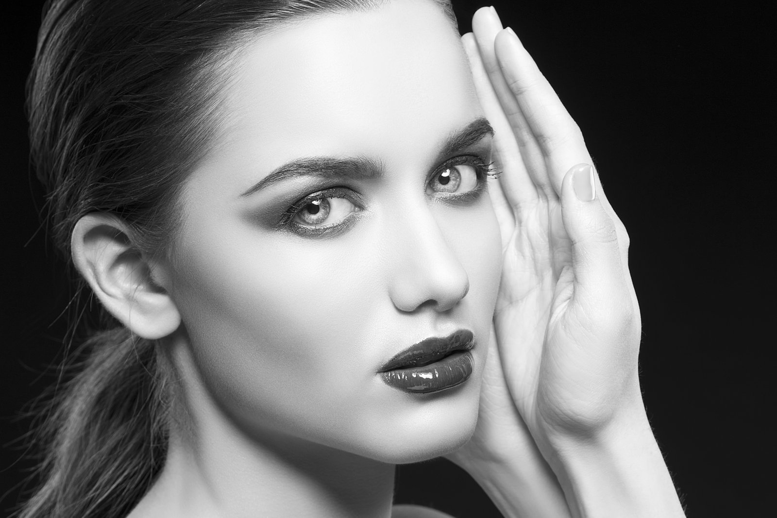
Every few months I get a new student in my workshop who shows me their eye retouching and asks why it looks “off.” The whites are too white. The iris looks painted. The catchlights are perfect little circles that no real light source ever made. They’ve done everything right, technically, and the result is completely unconvincing. I know that feeling intimately. Early in my retouching career, a client looked at a portrait I’d delivered and said, without any malice, “she looks like a doll.” That was the note. I’d nuked the life out of her eyes trying to make them pop.
That comment sent me back to basics, and what I found changed how I approach every eye edit since.
What Makes an Eye Look Real Versus Retouched
The eye is the most scrutinized area of any portrait, and our brains are wired to detect inauthenticity there faster than anywhere else. When we over-brighten the sclera (the whites), we’re erasing the natural warm shadow tones that live near the tear duct and in the corners. Those shadows are caused by real anatomy, the slight curvature of the eyeball, the way the eyelid folds over. Remove them and the eye becomes flat, almost cartoonish.
The iris has its own internal logic too. Light hits the top of the iris and falls off toward the bottom, so the upper portion is naturally darker, partly occluded by the eyelid and its shadow. Retouchers who paint a uniform brightness across the iris are ignoring that gradient, and the brain reads it immediately as wrong.
Understanding this is the prerequisite for everything else. We’re not adding light. We’re preserving and clarifying light that already exists.
The Four-Layer Stack I Use on Every Eye
My eye enhancement workflow lives inside a Photoshop group I call “The Godfather.” Every action I run on eyes goes in there. Here’s the stack, from bottom to top.
1. Sclera correction with a Curves adjustment layer (clipped, masked tightly) I add a Curves layer clipped to a rough selection of the whites and pull the midpoint up just slightly, usually no more than 5-8 output units from baseline. The key is painting the mask back out near the tear duct and inner corners with a soft brush at 15-20% opacity. This preserves the warm shadow pooling in those corners and keeps the eye looking wet and three-dimensional.
2. Iris contrast and depth with Dodge and Burn I work on a 50% gray layer set to Overlay, using a hard round brush at 2-3% exposure. I darken the top quarter of the iris (under the eyelid shadow) and very gently lighten the limbal ring, the dark circle around the edge of the iris. This tiny move adds serious depth. If you only do one thing in this list, do this.
3. Color saturation via Hue/Saturation (clipped, masked to iris only) I boost saturation by 10-20 points, never more, and I always check the result against a black-and-white version of the image. If the iris reads as an isolated bright patch in grayscale, I’ve gone too far. The goal is richer, not louder.
4. Catchlight cleanup on a new blank layer set to Normal Real catchlights are irregular. They reflect whatever was actually in the room. I never replace them entirely. What I do is clone out any secondary catchlights (usually from a fill card or bounce) using the Clone Stamp at 100% opacity on a separate layer, keeping only the primary light source. Two catchlights in an eye read as “studio.” One reads as natural.
Sharpening That Doesn’t Wreck Your Skin
I sharpen eyes separately from the rest of the face. The method I use is a High Pass filter on a merged stamp layer (Ctrl+Alt+Shift+E on a PC, Cmd+Option+Shift+E on Mac), set to Overlay blending mode, with the High Pass radius at 1.5-2.5 pixels depending on image resolution. I then mask this layer to cover only the iris, the limbal ring, and the lower lash line.
If I apply this sharpening to the skin as well, I’m amplifying texture I’d otherwise be smoothing. Keeping the sharpening mask tight, literally painting it in with a 40-50 pixel hard brush at 100% opacity, means I get crisp, present eyes sitting in natural-looking skin.
When Less Actually Means More
I had a student last year, a photographer transitioning into retouching the same way I did, who kept pushing her eye work further because the client had asked for “vibrant.” After her fourth revision, the eyes were technically brighter, more saturated, sharper, and completely dead. We walked it back together to her second revision, dialed saturation from +35 down to +18, reduced the Curves lift to show the warm inner-corner shadows again, and the client loved it.
Vibrant doesn’t mean maximum. It means alive. There’s a difference, and the difference is usually found by pulling back, not pushing forward.
Reading the Light Before You Touch Anything
The single habit that improved my eye work more than any technique was spending 60 seconds before touching a single slider to study where the light is actually falling in the image. Where is the key light coming from? Is there a rim light? What color is the ambient fill?
Every adjustment I make should be in service of that existing light, not inventing something new. When the retouching is working, the viewer doesn’t think “great eye work.” They just think the person in the photo has beautiful, expressive eyes.
That’s the whole job.
Comments
Leave a Comment