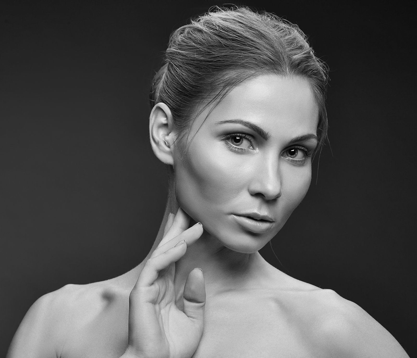
A client once told me my edits looked “like a wax museum.” She wasn’t wrong. I had smoothed every pore, blurred every shadow, and delivered what I genuinely thought was polished, professional work. I still have that file. I keep it in a folder called “Before I Knew Better,” and I open it maybe once a year just to feel something.
That was the edit that sent me down a year-long obsession with frequency separation, and it fundamentally changed how I approach headshot work. If you’ve ever delivered a retouched headshot and gotten feedback that it looks “too edited” or “a little off,” the problem is almost certainly not your eye. It’s your method.
The Real Problem With Headshot Skin (It’s Not the Blemishes)
Most people assume headshot retouching is about removing things: spots, redness, under-eye circles. But the more important challenge is preserving texture while correcting tone. Human skin has two visually distinct layers of information. There’s the color and luminosity layer, which carries blotchiness, redness, uneven shadows. And then there’s the texture layer, the actual pore structure, fine lines, and surface detail that makes skin read as real.
When we use a healing brush or a basic blur over the entire face, we collapse both layers at once. The blemish disappears, but so does the skin. What’s left reads as smooth in a way that no actual human face is smooth. Our brains are extraordinarily good at detecting this. It triggers the same mild unease as a CGI face that’s almost-but-not-quite human.
Frequency separation solves this by letting us work on those two layers independently.
How to Set Up Frequency Separation for Headshots
Here’s the exact setup I use in Photoshop. This takes about 90 seconds once it’s part of your muscle memory. I have a saved action for it named “Eternal Sunshine” if that tells you anything about how I spend my evenings.
Start with your base retouched file, spot healing done, any major distractions removed. Duplicate your background layer twice. Name the bottom copy “Color” and the top copy “Texture.”
Select the Color layer. Go to Filter, Blur, Gaussian Blur. For headshots shot at typical portrait distances (50mm to 85mm equivalent, subjects filling roughly 60-70% of the frame), I use a radius of 6-8 pixels. If you’re working with a tighter crop or a higher resolution file (anything above 40 megapixels), bump that to 10-12 pixels.
Now select the Texture layer. Go to Image, Apply Image. Set the Layer to your Color layer, Blending to Subtract, Scale to 2, Offset to 128. Click OK. Change the blend mode of this Texture layer to Linear Light.
You now have a fully functional frequency separation setup. Paint on the Color layer with a soft brush, low flow (3-8%), to even out tone. The texture above stays completely untouched. This is the difference between a headshot that reads as “professionally retouched” and one that reads as “that person actually looks like that, but better.”
Working the Color Layer Without Destroying the Face
The Color layer is where most of the actual work happens, and it’s also where most people go too far. The goal is not a perfectly even complexion. The goal is to reduce the visual noise that distracts from the person’s expression and features.
I sample color from a mid-tone area of the face (usually the cheek, avoiding any specular highlights) using Alt+click, then paint at 3-5% flow over areas of redness or blotchiness. I use a brush size roughly equal to the area I’m correcting, never a giant soft brush swept across the whole face. For under-eye circles specifically, I’ll often drop to 2% flow and do 15 to 20 slow passes rather than one heavy-handed stroke.
The Lasso tool is your friend here for more targeted work. A loose selection with a 25-30 pixel feather, then a Hue/Saturation adjustment clipped to the Color layer, lets me desaturate localized redness by 10-15 points without affecting the broader skin tone.
Where to Stop (The Edit You Don’t Make)
There’s a version of every headshot edit where you keep going. One more pass on the pores. A little frequency smoothing on the forehead. Dodge and burn on the cheekbones. I know this version intimately because I used to live there.
The reference check I use now: zoom out to 25%, which roughly approximates how the image reads at print size or on most screens. At 25%, if the skin looks right, it is right. I also keep a before/after toggle going throughout the session rather than only comparing at the end. It’s easy to lose calibration when you’ve been staring at a face for 40 minutes, and comparing against the original every 10 minutes recalibrates your eye.
The biggest workflow change I made after my “wax museum” era was building in a mandatory 20-minute break before final export. I make a cup of tea (I go through an embarrassing amount of it), do something entirely unrelated, then come back and look at the file fresh. I catch over-edits this way at least 30% of the time.
Sharpening at Export Without Wrecking the Work
All of this careful texture preservation gets undermined if you sharpen incorrectly at export. For web-optimized headshots (typically 1500-2000 pixels on the long edge), I use Smart Sharpen in Photoshop set to Amount 85%, Radius 0.8 pixels, with Reduce Noise at 10%. For print files going to a lab or agency at full resolution, I drop Amount to 60% and increase Radius to 1.2 pixels.
Apply sharpening to a merged stamp layer (Ctrl+Alt+Shift+E) so it stays non-destructive relative to your layered file. And sharpen last, after any resizing, because sharpening before you resize is one of those things that seems fine until you’re explaining to a client why their LinkedIn photo has a halo around their collar.
The throughline across all of this is the same principle: we’re not improving faces, we’re removing the visual static that gets between a viewer and the actual person. Do that well, and the retouching becomes invisible, which is exactly where it belongs.
Comments (13)
Great breakdown. The step-by-step approach really helps.
This is fantastic. I've been recommending this approach to my readers too.
The before and after really sells it. Incredible difference.
Just used this on a wedding shoot edit. Client was thrilled.
Just subscribed. If the rest of your content is this good, I'm in.
Been doing this wrong for years apparently. Thanks for the wake-up call.
Clear and practical. No fluff. Appreciate that.
Clear and practical. No fluff. Appreciate that.
This is the kind of content that keeps me coming back.
Love this. I referenced a similar technique in one of my recent posts. Always good to see other perspectives.
Never thought of approaching it this way. Really creative.
Applied this to my portfolio shots and the improvement is noticeable.
This is fantastic. I've been recommending this approach to my readers too.
Leave a Comment