The Complete Guide to Color Correction in Portrait Retouching
Color correction is where portraiture truly comes alive. I’ve learned that even the most beautifully lit portrait can fall flat if the colors aren’t working in harmony. Whether you’re editing a single headshot or batch processing from a wedding, understanding color correction fundamentally changes how your portraits feel and how your clients respond to them.
Let me walk you through the techniques I use daily to transform color in my retouching workflow.
Why Color Correction Matters More Than You Think
Before we dive into the how, let’s talk about why. When we correct color, we’re not just fixing problems—we’re creating mood and directing attention. A portrait with accurate, warm skin tones feels trustworthy and approachable. One with a color cast feels off, even if viewers can’t pinpoint why.
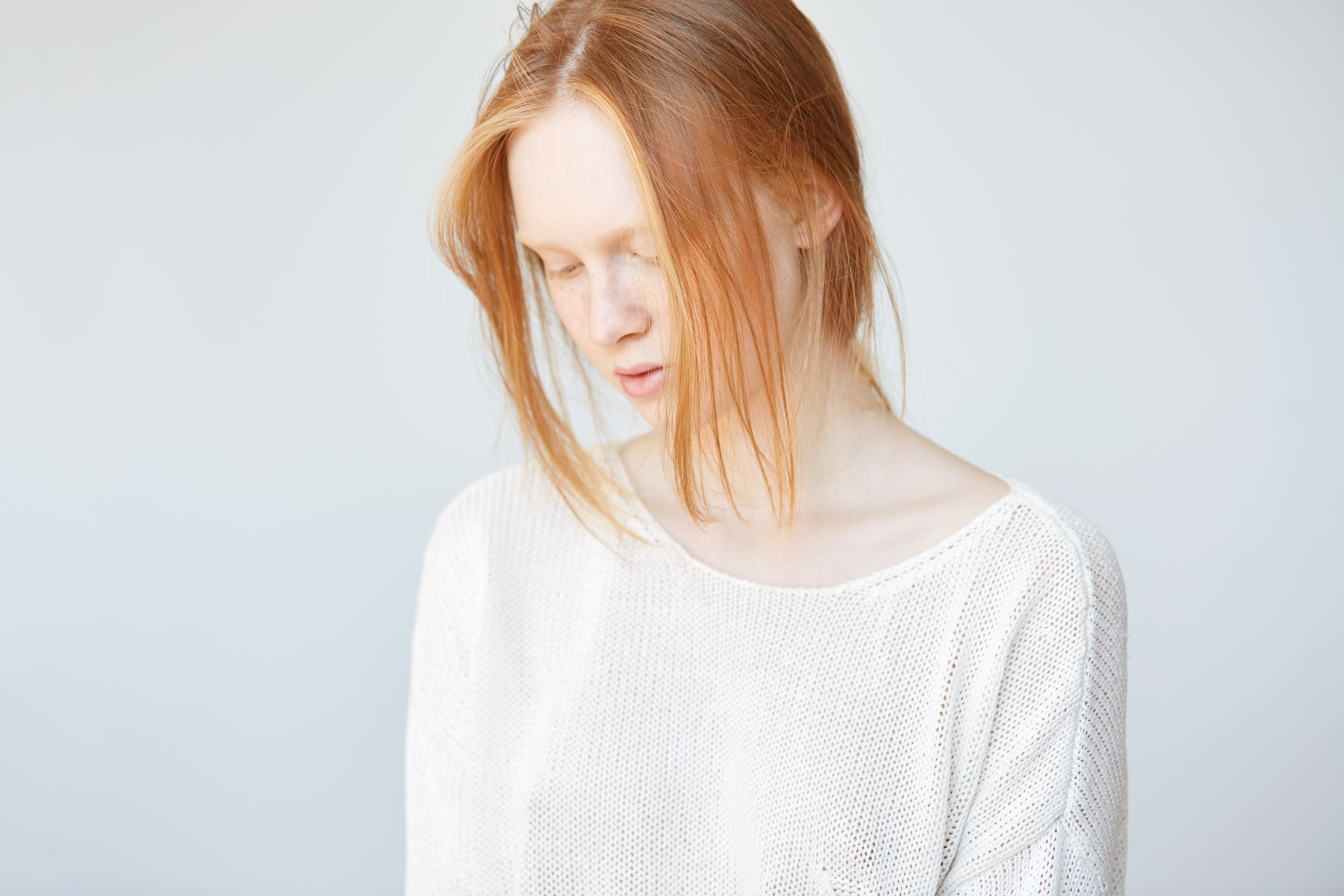
I think of color correction as a conversation between three elements: skin tone, background, and overall image temperature. When these three are in harmony, your portrait sings.
Start with White Balance
The foundation of every color correction is proper white balance. In Lightroom, I always begin here—it’s where we establish our baseline.
Here’s what I do: I use the eyedropper tool (the white balance selector) and click on something that should be neutral in the image. For portraits, this is often a gray card if you’ve shot with one, but you can also use the whites of the eyes or teeth as reference points.
If you’ve shot in daylight with a color cast (maybe that golden hour shoot had too much warmth, or your studio lighting skewed cool), adjusting the Temperature slider to 4500-5500K typically gives us a neutral starting point. Then I use the Tint slider—usually between -5 and +10—to balance any remaining green or magenta tones.
The Skin Tone Sweet Spot
Once white balance is set, we focus specifically on skin. This is where warmth becomes an aesthetic choice rather than a correction.
I typically warm skin tones slightly using the Vibrance and Saturation sliders. Here’s my approach: I increase Vibrance by +10 to +20 (this adds color without oversaturation), then boost the specific warm tones by increasing the orange and red saturation in the HSL panel by about +10 to +15.
In Photoshop, I use Color Balance adjustments to fine-tune further. For midtones—where most skin detail lives—I push the slider toward Red and Yellow, adding depth and dimension. I’m usually moving the Shadows toward Red slightly to preserve contour, and keeping Highlights more neutral to maintain luminosity.
Addressing Color Casts Surgically
Sometimes one area has a stubborn cast. Maybe the subject has green undertones, or there’s an unflattering magenta tint.
My solution? Create a Hue/Saturation adjustment layer in Photoshop targeting just that color range. If I’m correcting a greenish cast, I select the Greens channel, desaturate slightly (-20 to -30), and shift the Hue slider toward Red (+5 to +10). This is far more precise than broad adjustments that affect the entire image.
The Background Matters Too
We can’t ignore what surrounds our subject. A warm background can throw off perceived skin tone, making it look cooler by comparison.
I check my background color early in my workflow. If it’s competing with the subject, I use selective color adjustments or even a Curves adjustment layer with a layer mask to warm or cool just that area. The goal is complementary contrast—the background should support, not fight, your subject’s skin tones.
Final Refinement: The Luminosity Approach
Here’s something that changed my work: I always duplicate my color-corrected layer and set it to Luminosity blending mode. This preserves all my color work while allowing me to fine-tune brightness separately, preventing color shifts when I adjust exposure in final steps.
Trusting Your Eye and the Numbers
I recommend calibrating your monitor if you haven’t already. Color correction is subjective, but you need a reliable reference point. I also step back from my screen regularly—sometimes our eyes adjust to incorrect color after staring too long.
Color correction is a skill that improves with practice and intention. Start with these foundational steps, and you’ll develop an intuition for what each image needs.
Comments
Leave a Comment