Video Tutorials
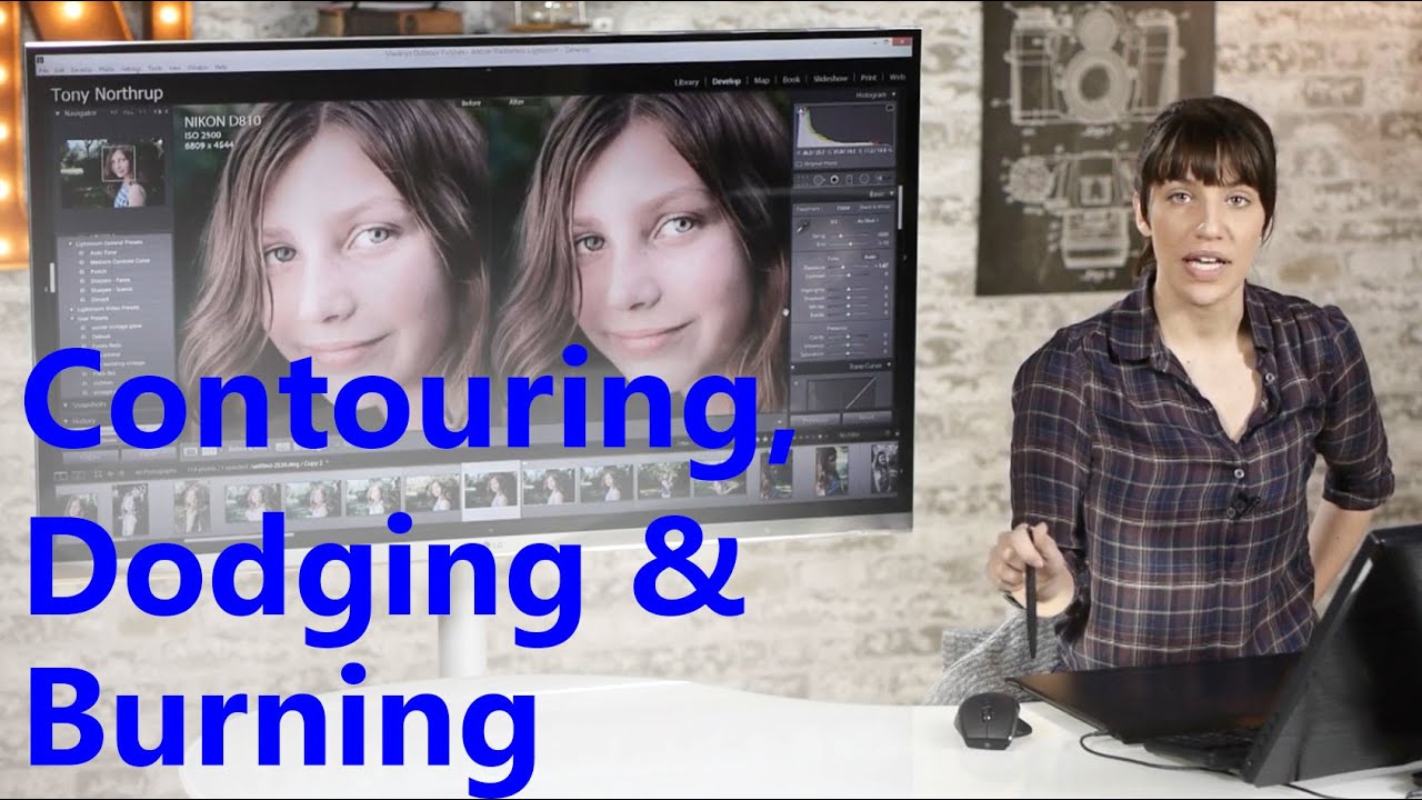
Contour With Light: Using Dodge & Burn in Lightroom to Shape a Portrait Like a Makeup Artist
There is a specific kind of client feedback that stays with you. Early in my retouching career, someone described my skin edits as “plastic-looking,” and I spent the next several months trying to figure out exactly what I had done wrong. The answer, it turned out, was that I had been treating exposure as a global problem. I would lift or lower the whole image and call it a day. What I was missing was the understanding that light shapes a face the same way a makeup artist does, and that Lightroom’s adjustment brush gives us the precision to do that shaping ourselves, one brushstroke at a time.