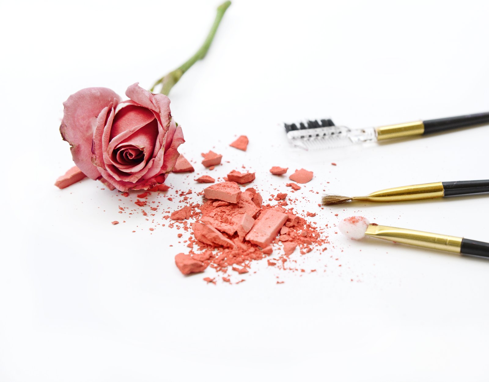
Why Your Portrait Colors Look Wrong (And the Correction Workflow That Actually Fixes Them)

Why Your Portrait Colors Look Wrong (And the Correction Workflow That Actually Fixes Them)

The Muddy Skin Problem Nobody Talks About Enough Last winter I was wrapping up a batch of beauty shots for a skincare client, feeling pretty good about my curves work, when I zoomed out and noticed something immediately wrong. The model’s face looked vaguely greenish, like she’d spent the week slightly ill. The background was a clean white. The photographer had shot under LED panels mixed with a daylight fill card, and my white balance correction hadn’t gone nearly deep enough.

How Sean Tucker's Lightroom Portrait Workflow Finally Got My Skin Tones Right

How Sean Tucker's Lightroom Portrait Workflow Finally Got My Skin Tones Right

Last month I delivered a batch of beauty campaign edits and the creative director flagged something I hadn’t noticed myself: the model’s skin had a faint magenta cast in the shadows that made her look slightly unwell in certain crops. Not dramatic, not “plastic-looking,” just subtly off. The kind of thing a client catches and you can’t unsee afterward. I went back through my workflow looking for where it crept in, and that hunt is what landed me on this Sean Tucker tutorial the same evening.

What a Mandalorian Scene Taught Me About Cinematic Lighting (And Why It Matters for Beauty Work)

What a Mandalorian Scene Taught Me About Cinematic Lighting (And Why It Matters for Beauty Work)

I’ve been thinking a lot lately about light. Not just the kind I sculpt in Photoshop after a shoot, but the kind that gets built from scratch, before a single pixel exists. A beauty client came to me last spring asking for campaign imagery that felt “cinematic but grounded,” and I realized I didn’t have a strong enough mental model for how cinematic light actually gets constructed. I knew how to retouch it.

Why Your Portraits Look Flat (And How Dodge and Burn Actually Fixes It)

Why Your Portraits Look Flat (And How Dodge and Burn Actually Fixes It)

The first time a client told me my retouching looked “plastic,” I was mortified. I had spent two hours on that image. The skin was smooth, the blemishes were gone, and the color was even. It looked, to my untrained eye, finished. What I didn’t understand yet was that I had removed not just the flaws but the depth. The face had no shadow, no structure, no life. It looked like a mask sitting in front of a head rather than an actual human face.

Why I Stopped Duplicating Layers for Every Retouch (And What I Do Instead)

Why I Stopped Duplicating Layers for Every Retouch (And What I Do Instead)

Last month I was deep in a skin retouching pass for a haircare campaign, three hours in, when my client asked me to pull back the smoothing on the forehead “just a little.” Simple request. Except I’d been duplicating layers the way I always had, flattening as I went, and suddenly “just a little” meant either starting over or doing some very creative explaining. I’ve been retouching beauty work long enough to know better, and yet there I was, completely cornered by my own workflow.

How to Add Depth and Dimension to Flat-Looking Portrait Photos in Photoshop

How to Add Depth and Dimension to Flat-Looking Portrait Photos in Photoshop

A few weeks ago I was finishing up a batch of beauty edits for a skincare client and kept running into the same problem. The shots were technically clean, skin looked smooth, color was dialed in, but something was missing. Every image felt a little… flat. Like a drawing of a face rather than a face. I’d been so focused on removing imperfections that I’d accidentally ironed out the natural shadows and highlights that give skin its three-dimensional quality.

Why Dodge and Burn Is the Last Retouching Skill You'll Want to Learn (and the First You Should)

Why Dodge and Burn Is the Last Retouching Skill You'll Want to Learn (and the First You Should)

I still have the file. It lives in a folder I’ve never deleted, labeled “DO NOT SHOW ANYONE,” and every time I open Photoshop it’s sitting there, waiting. My first serious retouching attempt on a beauty portrait. The skin looks like it was painted with a foam roller. No dimension, no depth, no life. Just a flat, airbrushed approximation of a human face. What I was missing wasn’t a better plugin or a fancier frequency separation technique.

Frequency Separation Actually Explained: Why Your Skin Retouching Looks Fake (And How to Fix It)

Frequency Separation Actually Explained: Why Your Skin Retouching Looks Fake (And How to Fix It)

The first time a client told me my retouching looked “plastic,” I had no idea what she meant. I thought I’d done a beautiful job. The skin was smooth, the blemishes were gone, the whole image had this polished magazine quality I’d been chasing. She pulled up a reference image on her phone, slid it across the table, and said, “I want to look like that. Yours looks like a wax figure.

Portrait Cleanup Before You Touch the Skin: Why the Background Is Costing You More Time Than You Think

Portrait Cleanup Before You Touch the Skin: Why the Background Is Costing You More Time Than You Think

Last week I opened a portrait from a beauty brand shoot and spent forty minutes working on the model’s skin before I noticed it. A single strand of hair, ghosted across her left shoulder, catching the backlight in a way that made it look like a scar. I had to repaint half the shoulder. If I’d caught it in the first five minutes, it would have taken thirty seconds with the Clone Stamp.

Why Your Portraits Look Flat (And How Dodge and Burn Fixes It From the Inside Out)

Why Your Portraits Look Flat (And How Dodge and Burn Fixes It From the Inside Out)

A few years into my retouching career, I got a message from a client that I still think about. She’d sent her finished portraits to a makeup artist friend, who looked at them and said they looked “a little plastic.” Not bad, exactly. Just… off. Like the face had been buffed smooth and then lit from nowhere in particular. I knew exactly what had gone wrong. I’d been so focused on removing what I didn’t want that I’d forgotten to keep what made the face look real.

The Art of Subtle Makeup Retouching: Enhancing Beauty Without Overdoing It

The Art of Subtle Makeup Retouching: Enhancing Beauty Without Overdoing It

The Art of Subtle Makeup Retouching: Enhancing Beauty Without Overdoing It When I first started retouching portraits, I made the same mistake many editors do—I thought bigger edits meant better results. Over time, I learned that the most stunning makeup retouching is often the work people don’t notice. It’s about enhancement, not transformation. Let me share what I’ve discovered about creating makeup edits that feel authentic. Understanding Your Starting Point Before we touch a single slider, I always spend time studying the original image.

The Art of Subtle Beauty Editing: Enhancing Without Overdoing

The Art of Subtle Beauty Editing: Enhancing Without Overdoing

The Art of Subtle Beauty Editing: Enhancing Without Overdoing When I first started retouching portraits, I made a mistake I see many editors make: I assumed more editing meant better results. I’d smooth every pore, brighten every highlight, and blur away every hint of texture. The photos looked plasticky and lifeless—nothing like the confident, genuine people I’d photographed. Over the years, I’ve learned that the best beauty editing is the kind nobody notices.