Frequency Separation: The Technique That Stopped My Edits From Looking Like Plastic

Frequency Separation: The Technique That Stopped My Edits From Looking Like Plastic

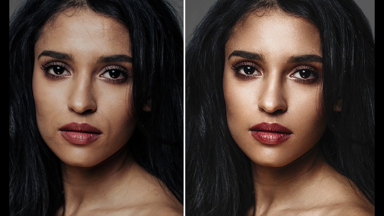
A client called me once to say my retouching looked “like a video game character.” I had spent two hours on that image. I had smoothed every pore, every shadow, every subtle line, and I handed back something that looked like it had been poured from a mold. She was kind about it, but I still have that file saved on an old hard drive as a personal cautionary tale. That was the moment I understood that I had been solving the wrong problem.

Frequency Separation for Real Skin: What I Took Away from Jessica Kobeissi's Retouch & Chill

Frequency Separation for Real Skin: What I Took Away from Jessica Kobeissi's Retouch & Chill

There is a particular kind of dread that comes with opening a portrait file and seeing skin that needs serious work. Not “dust off a blemish” work. Real texture, real unevenness, real light that caught every pore. Early in my retouching career I handled that dread badly. I’d over-smooth, over-blur, and hand back something that looked more like a vinyl doll than a person. A client once told me the skin looked “plastic.

Frequency Separation in Photoshop: A Step-by-Step Breakdown of Aaron Nace's Game-Changing Technique

Frequency Separation in Photoshop: A Step-by-Step Breakdown of Aaron Nace's Game-Changing Technique

There is a specific kind of dread that comes with zooming into 100% on a retouched face and realizing the skin looks like a wax museum exhibit. I know that dread well. Early in my retouching career, I was so focused on erasing every shadow and blotch that I was also erasing everything that made the skin look like skin. A client put it plainly: “She looks plastic.” That note stung, but it pushed me to find a better way.

How to Freestyle a Portrait Retouch in Photoshop (Without a Rigid Plan)

How to Freestyle a Portrait Retouch in Photoshop (Without a Rigid Plan)

There’s a version of portrait retouching that feels like following a recipe. Same steps, same order, same result every time. For a long time, that was me. I built elaborate action sets (I still name them after movies – my frequency separation stack is called “The Prestige”) and ran every portrait through the same pipeline. It was efficient. It was also making my work look a little lifeless, like I was manufacturing faces rather than finishing photographs.

Frequency Separation Without the Headache: A Step-by-Step Breakdown of Joel Grimes' Approach

Frequency Separation Without the Headache: A Step-by-Step Breakdown of Joel Grimes' Approach

There is a specific kind of dread that comes from over-retouching skin. I know it well. Early in my retouching career, I handed a beauty client a set of images so smoothed-out that she emailed back asking if I had accidentally used a blur filter on her face. I had not. I had just been using the wrong tools with too much confidence. Frequency separation was the technique that eventually pulled me out of that hole, but for a long time I avoided it because every tutorial I found turned it into a 45-minute production involving terminology that felt designed to intimidate.

Why Your Headshots Look Retouched (And How to Fix That Before the Client Notices)

Why Your Headshots Look Retouched (And How to Fix That Before the Client Notices)

The first headshot I ever retouched that a client actually complained about wasn’t overexposed or poorly cropped. It was technically clean. Sharp eyes, even skin tone, good contrast. The client called me and said, very politely, “I just look kind of… plastic?” I had smoothed her skin so aggressively that the natural texture was gone, and what was left was something between a wax figure and a LinkedIn filter. I kept that file.

The Hidden Frequency Separation Secret That Saves Flat-Looking Skin

The Hidden Frequency Separation Secret That Saves Flat-Looking Skin

The Hidden Frequency Separation Secret That Saves Flat-Looking Skin I’ve noticed something fascinating happening in portrait retouching conversations lately. Editors everywhere are discovering that their beautifully smoothed skin often loses something critical the moment a client zooms out. The detailed, dimensional quality vanishes, leaving behind a plastic-looking result that feels disconnected from reality. Here’s what I’ve found: there’s a specific step within the frequency separation workflow that most of us gloss over—and it’s actually the key to maintaining that natural, three-dimensional quality we’re all chasing.

Why Your Skin Retouching Looks Fake (And the Frequency Separation Fix That Actually Works)

Why Your Skin Retouching Looks Fake (And the Frequency Separation Fix That Actually Works)

Early in my retouching career, a client sent back a set of beauty portraits with a note that still lives rent-free in my head: “The model looks like she’s made of wax.” I had smoothed the skin beautifully, or so I thought. The color was even, the blemishes were gone, and the whole image had this clean, polished look I was genuinely proud of. But she was right. I had removed every pore, every subtle shadow, every piece of visual information that tells your brain you’re looking at a human face.

Why Your Makeup Retouching Looks Fake (And the Layer Order That Fixes It)

Why Your Makeup Retouching Looks Fake (And the Layer Order That Fixes It)

A client emailed me once, midway through a campaign project, to say my lip color looked “like a crayon drawing on a face.” She wasn’t wrong. I had painted the color directly onto a merged layer, ignored the skin texture entirely, and wondered why it looked like a sticker someone had slapped onto a photograph. That was about seven years ago, right when I was transitioning out of wedding photography and into beauty work full-time.

Why Your Headshot Edits Look Overdone (And the Exact Workflow That Fixed Mine)

Why Your Headshot Edits Look Overdone (And the Exact Workflow That Fixed Mine)

A client once told me my retouching looked “like a wax museum.” She wasn’t wrong. I still have that file saved in a folder called “Humbling Moments,” and I open it maybe once a year to remind myself what over-processing actually looks like when you’re too close to the screen to see it. Headshots are the trickiest category in portrait retouching, not because the techniques are complicated, but because the margin for error is almost zero.

Frequency Separation Actually Explained: Why Your Skin Retouching Looks Fake (And How to Fix It)

Frequency Separation Actually Explained: Why Your Skin Retouching Looks Fake (And How to Fix It)

The first time a client told me my retouching looked “plastic,” I had no idea what she meant. I thought I’d done a beautiful job. The skin was smooth, the blemishes were gone, the whole image had this polished magazine quality I’d been chasing. She pulled up a reference image on her phone, slid it across the table, and said, “I want to look like that. Yours looks like a wax figure.

Frequency Separation: The Game-Changing Technique for Flawless Skin

Frequency Separation: The Game-Changing Technique for Flawless Skin

Frequency Separation: The Game-Changing Technique for Flawless Skin When I first discovered frequency separation, it transformed how I approach portrait retouching. This technique gives us something that traditional healing brushes simply can’t: the ability to edit skin texture and color independently. If you’ve ever struggled to smooth skin without making it look plastic, or found yourself fighting with color corrections that affect sharpness, this method is about to become your best friend.