Why Eyes Fall Flat in Portraits (And the Exact Workflow I Use to Fix Them)

Why Eyes Fall Flat in Portraits (And the Exact Workflow I Use to Fix Them)

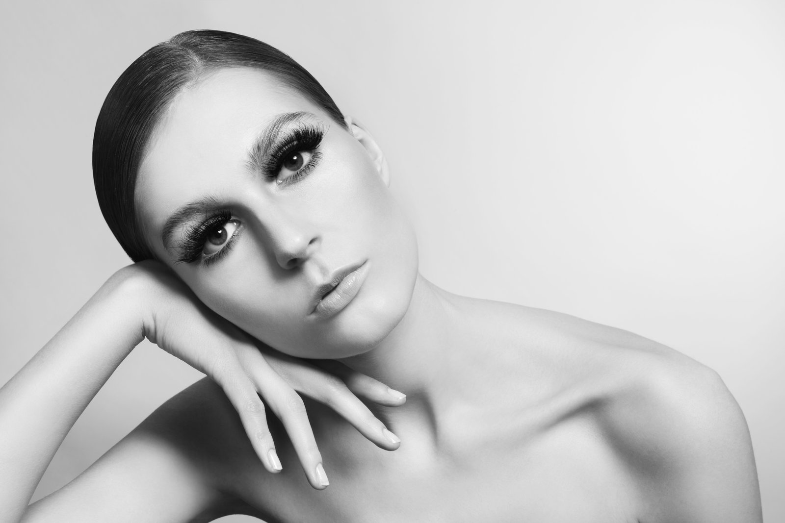
A few years into my retouching work, a client sent me an email I still think about. She said the eyes in her campaign images looked “glassy, like a doll.” She wasn’t wrong. I’d brightened the irises, added a catch light, sharpened the lashes, and somehow made a real person look less alive than when I started. That email taught me something I now open every workshop with: eyes don’t need to be brighter.

Why Your Headshots Look Over-Edited (And the Frequency Separation Fix That Actually Works)

Why Your Headshots Look Over-Edited (And the Frequency Separation Fix That Actually Works)

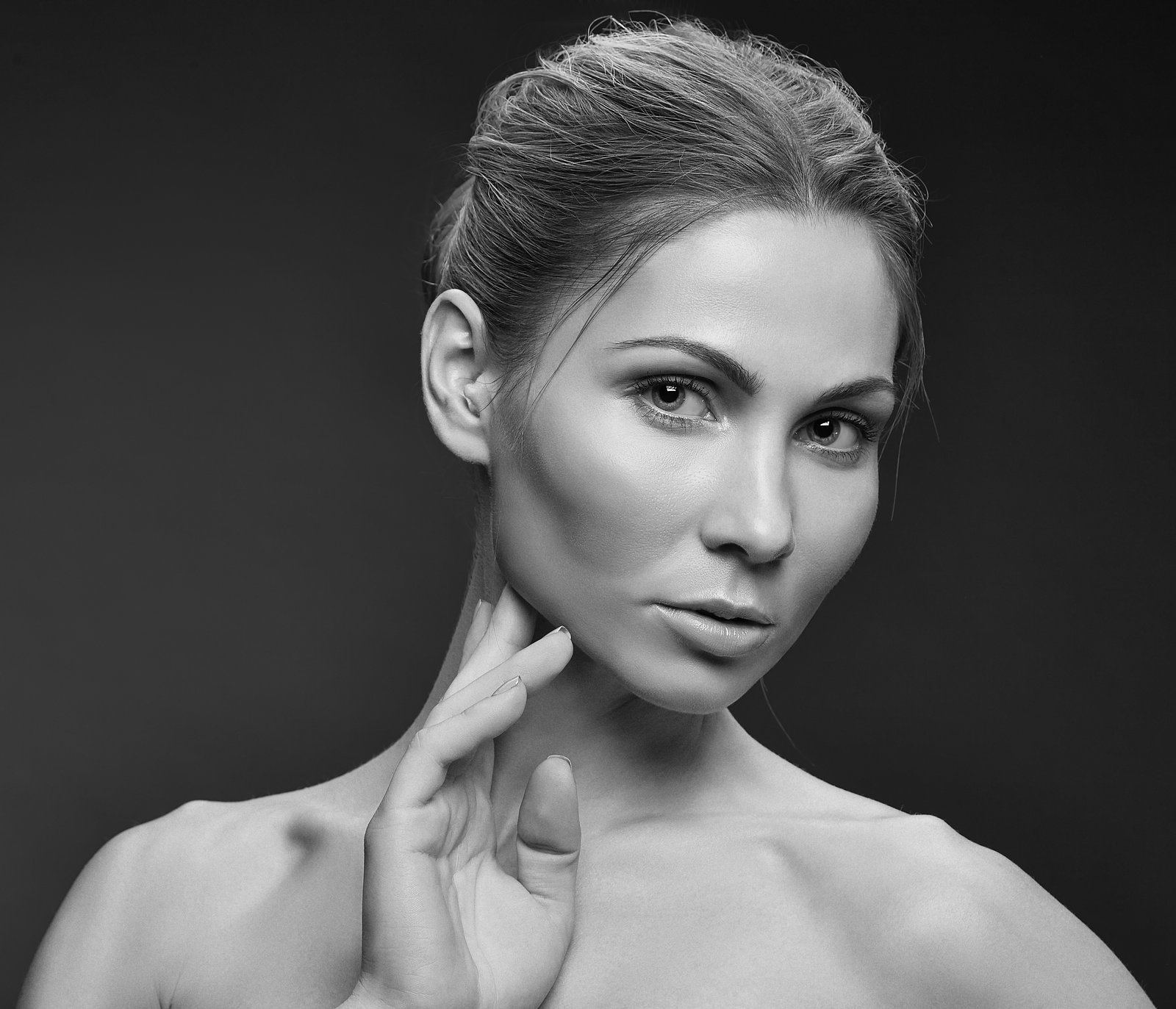
A client once told me my edits looked “like a wax museum.” She wasn’t wrong. I had smoothed every pore, blurred every shadow, and delivered what I genuinely thought was polished, professional work. I still have that file. I keep it in a folder called “Before I Knew Better,” and I open it maybe once a year just to feel something. That was the edit that sent me down a year-long obsession with frequency separation, and it fundamentally changed how I approach headshot work.

Why Your Portraits Still Look Flat (And How Dodge and Burn Fixes It at the Source)

Why Your Portraits Still Look Flat (And How Dodge and Burn Fixes It at the Source)

There’s a before-and-after I still think about. Early in my retouching career, I handed off a set of portraits to a client and felt genuinely proud of the work. Smooth skin, clean tones, everything looking polished. She emailed back the next morning and said the images looked “a little plastic, like a video game character.” I wanted to disappear into my standing desk. What I had done was chase imperfections surface by surface, smoothing and blurring, without ever asking myself why the skin looked off in the first place.

Why Your Skin Retouching Looks Fake (And the Frequency Separation Fix That Changed Everything)

Why Your Skin Retouching Looks Fake (And the Frequency Separation Fix That Changed Everything)

A few years into my retouching career, a client emailed me back after receiving her finished images. She was polite about it, which almost made it worse. “They look a little… smooth?” she wrote. “Like, really smooth.” I opened the files and felt my stomach drop. I had obliterated her skin. Every pore, every fine line, every piece of texture that made her look like a real human being, gone. She looked like she’d been rendered in a video game engine from 2009.

The 4-Layer Method I Use to Make Eyes Look Alive Without Looking Retouched

The 4-Layer Method I Use to Make Eyes Look Alive Without Looking Retouched

A few years back, a client sent me a revision note that stopped me cold. She’d hired me to retouch headshots for her acting portfolio, and her feedback on the eye work was: “They look like doll eyes. Can you make me look like a person again?” She was right. I’d gone in hard with a Hue/Saturation layer, cranked the blue channel on her irises, and added a specular highlight so bright it looked like a flashlight was aimed directly at her face.

Why Your Skin Retouching Looks Fake (And the Frequency Separation Fix That Actually Works)

Why Your Skin Retouching Looks Fake (And the Frequency Separation Fix That Actually Works)

A few years into freelancing, I got an email from a client that I still think about. She was a cosmetics brand, small but growing, and after I delivered the first round of edits she wrote back with three words: “too plastic, sorry.” No other notes. Just that. I knew exactly what she meant. I had smoothed the model’s skin until it looked like it had been buffed with a belt sander.

Why Your Portrait Colors Look Off (And the Correction Workflow That Actually Fixes Them)

Why Your Portrait Colors Look Off (And the Correction Workflow That Actually Fixes Them)

The Greenish Skin Problem Nobody Warns You About A few years back, I delivered a full gallery to a cosmetics client, feeling pretty good about the work. The art director called me within the hour. The model’s skin looked green. Not dramatically green, but enough that the lipstick, which was supposed to read as a warm coral, looked muddy and wrong against it. I had corrected exposure, cleaned up the skin, and completely missed a cyan-green color cast baked into the shadows from a nearby white wall that had been painted with a slight sage tint.

The 15-Minute Eye Enhancement Workflow That Stopped My Clients From Looking Like Mannequins

The 15-Minute Eye Enhancement Workflow That Stopped My Clients From Looking Like Mannequins

A few years into freelancing, I got a message from a bride whose wedding gallery I’d just delivered. She loved the photos, she said, but something about the close-up portraits felt “off.” She couldn’t name it exactly. “The eyes look like a video game character,” she wrote. I knew exactly what she meant because I had done it to myself a hundred times before I finally understood what I was actually destroying when I pushed the wrong sliders.

Why Your Portraits Look Flat (And How Dodge and Burn Fixes It From the Inside Out)

Why Your Portraits Look Flat (And How Dodge and Burn Fixes It From the Inside Out)

Early in my retouching career, I got a message from a client that I still think about. She looked at the before-and-after of her portrait and said, “My skin looks like plastic.” She wasn’t wrong. I had smoothed everything, healed everything, and in doing so I had erased the very thing that made her face look like a face, which was dimension. Light and shadow, the tiny shifts in tone that tell your eye where a cheekbone ends and a temple begins.

The Five-Minute Portrait Cleanup That Makes Everything Else Work Better

The Five-Minute Portrait Cleanup That Makes Everything Else Work Better

I opened a RAW file last Tuesday, a headshot from a brand shoot, and counted eleven things wrong with it before I even touched the develop sliders. A stray hair bisecting the subject’s left eye. A collar tag peeking above the neckline. Mascara flecked under one lower lash line. Catchlight shaped like a rectangular softbox with a visible ceiling tile reflected inside it. And that was just the top half of the frame.

Why Your Skin Retouching Looks Fake (And How Frequency Separation Actually Fixes It)

Why Your Skin Retouching Looks Fake (And How Frequency Separation Actually Fixes It)

The first time a client told me my retouching looked “plastic,” I wanted to disappear into my chair. I’d spent three hours on that image, smoothing and blending, and what I delivered looked less like a human being and more like a department store mannequin. The problem wasn’t effort. The problem was that I was treating skin as one single thing, when it’s actually two completely different things stacked on top of each other.

Frequency Separation Actually Explained: How to Retouch Skin Without Making It Look Fake

Frequency Separation Actually Explained: How to Retouch Skin Without Making It Look Fake

A few years into my retouching career, a client sent me an email I still think about. She’d hired me to retouch a headshot series for her brand campaign, and after I delivered the files, she wrote back to say the skin looked “a little like rubber.” Not bad, exactly. Just wrong. Like the faces belonged to very convincing mannequins. I had softened every blemish, every pore, every shadow, until the texture was completely gone.